rn-cute-charts


A high-performance, delightful charting library for React Native built on Skia and Reanimated.
Charts Available
- Vertical Bar Chart: Tap-interactive vertical bar charts with optional horizontal scroll
- Horizontal Bar Chart: Tap-interactive horizontal bar charts with optional vertical scroll
- Line Chart: Smooth, gesture-driven line charts for generic labeled data
- Time Series Chart: Gesture-driven line charts for timestamp-based financial/time data
- Candlestick Chart: Interactive OHLC candlestick charts with pinch zoom and pan
- Pie Chart: Tap-interactive pie charts with animated slice highlight
Installation
Install peer dependencies first. These are the dependencies you will have by default probably in any app with "cool" animations. Namely : skia, reanimated, gesture-handler and worklets.
npm install @shopify/react-native-skia react-native-reanimated react-native-gesture-handler react-native-workletsYou also need a d3.js dependency :
npm install d3-shapeThen install the library:
npm install rn-cute-chartsCompatibility
- React Native >= 0.83.0
- React >= 19.0.0
- iOS & Android
Important Notes
- Wrap your app in
GestureHandlerRootViewfromreact-native-gesture-handler(typically in your root layout file)
A note on bad data
We do our best to handle messy data gracefully instead of crashing:
- Bars with invalid/missing values render at 0 width/height instead of breaking layout.
- Line and Time Series charts break the path at gaps caused by bad points, rather than drawing through them.
- The value label on Line/Time Series charts shows
"-"when the cursor lands on a bad/unresolvable point, instead of showing a stale or wrong number.
That said — this is best-effort, not a substitute for clean input. We handle the math and rendering; you're still responsible for the quality of the data you pass in. Malformed timestamps, NaN/null values, or unsorted data can still produce a chart that's technically non-crashing but visually odd (frozen cursors, sudden gaps, zero-size bars). If something looks wrong, check your data first.
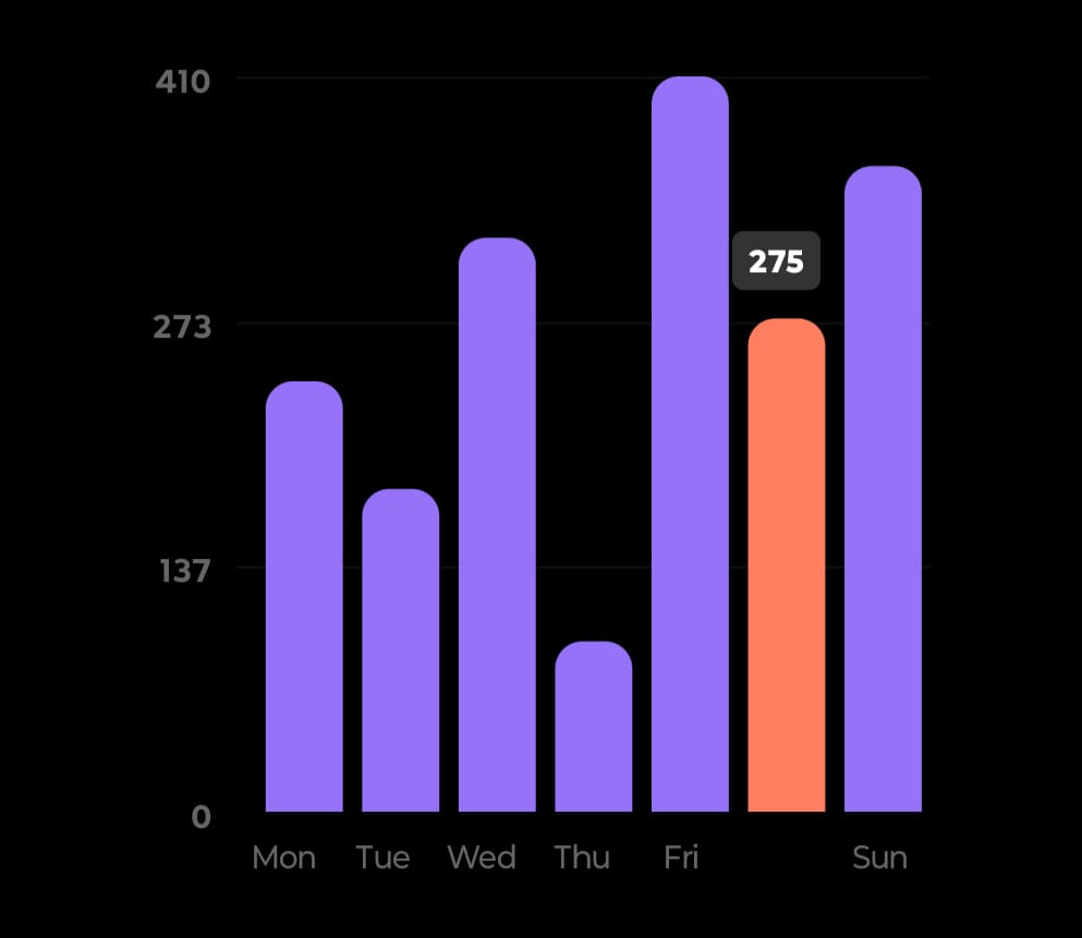
Vertical Bar Chart
Features
- Tap a bar to highlight it and show its value in a floating bubble
- Spring, linear, or no tap animation — fully configurable
- Optional horizontal scroll when bars don't fit the given width
- All UI rendered with Skia
- Scroll sync between bars and X-axis labels runs on the UI thread (zero lag)
Quick Start
import { VerticalBarChart } from "rn-cute-charts";
import type { BarDataItem } from "rn-cute-charts";

const data: BarDataItem[] = [
  { x: "Mon", y: 120 },
  { x: "Tue", y: 180 },
  { x: "Wed", y: 134 },
];

export default function App() {
  return (
    <VerticalBarChart
      width={320}
      height={320}
      data={data}
      color="#9672f8"
      activeColor="#ff7e5f"
    />
  );
}
API Reference
| Prop | Type | Default | Description |
|---|---|---|---|
width |
number |
required | Chart width |
height |
number |
required | Chart height |
data |
BarDataItem[] |
required | Array of { x: string, y: number } |
color |
string |
"#9672f8" |
Default bar color |
activeColor |
string |
"#ff7e5f" |
Color of the tapped/active bar |
barGap |
number |
0.2 |
Padding ratio between bars (0–1) |
bend |
number |
10 |
Top corner radius of bars |
numYLabels |
number |
3 |
Number of Y-axis tick labels |
fontSize |
number |
12 |
Font size for axis labels and the value badge |
labelFontColor |
string |
#f0f0f0 |
Label text colour |
labelActiveFontColor |
string |
#fff |
Label text colour when active/selected |
badgeBackgroundColor |
string |
"#333" |
Background colour of the active bar's value badge |
badgeFontColor |
string |
"#fff" |
Text colour of the active bar's value badge |
scrollable |
boolean |
false |
Enable horizontal scroll when bars are too many to fit |
minBarWidth |
number |
25 |
Minimum bar width in px when scrollable |
xLabelHeight |
number |
0.1 |
Fraction of height reserved for the x-axis category label strip |
yLabelWidth |
number |
0.20 |
Fraction of width reserved for the y-axis numeric label strip |
animationType |
AnimationType |
"spring" |
Tap animation: "spring", "linear", or "none" |
animationConfig |
AnimationConfig |
see below | Config for the animation driver |
jsThrottleMs |
number |
100 |
Throttle (ms) for JS-thread updates during scroll. See warning below. |
jsThrottleMswarning: lowering this too far increases how often React state updates fire during scroll/pan. Too low a value (e.g. under ~30–40ms) can flood the JS thread and crash or freeze the app on lower-end devices. Raise it, don't lower it, if you run into performance issues.
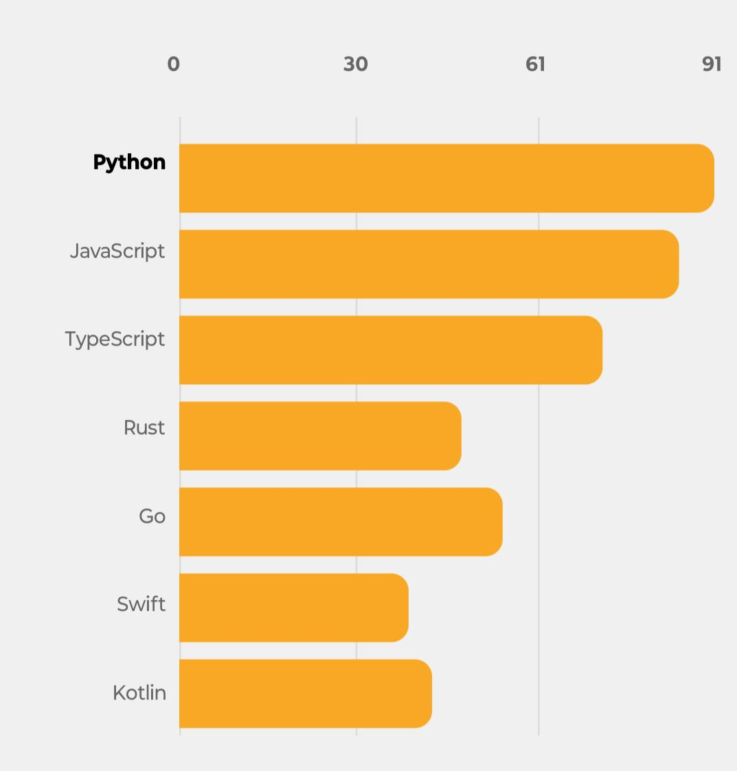
Horizontal Bar Chart
Features
- Same feature set as Vertical Bar Chart, rotated 90°
- Bars grow rightward from the Y-axis
- Optional vertical scroll with sticky top numeric axis
- Scroll sync between bars and category labels runs on UI thread
Quick Start
import { HorizontalBarChart } from "rn-cute-charts";
import type { BarDataItem } from "rn-cute-charts";

const data: BarDataItem[] = [
  { x: "Sales", y: 40 },
  { x: "Support", y: 25 },
  { x: "Marketing", y: 20 },
];

export default function App() {
  return (
    <HorizontalBarChart
      width={320}
      height={320}
      data={data}
      color="#9672f8"
      activeColor="#ff7e5f"
    />
  );
}
API Reference
| Prop | Type | Default | Description |
|---|---|---|---|
width |
number |
required | Chart width |
height |
number |
required | Chart height |
data |
BarDataItem[] |
required | Array of { x: string, y: number } |
color |
string |
"#9672f8" |
Default bar color |
activeColor |
string |
"#ff7e5f" |
Color of the tapped/active bar |
barGap |
number |
0.2 |
Padding ratio between bars (0–1) |
bend |
number |
10 |
Right corner radius of bars |
numXLabels |
number |
3 |
Number of X-axis (numeric) tick labels |
fontSize |
number |
12 |
Font size for axis labels and the value badge |
labelFontColor |
string |
#f0f0f0 |
Label text colour |
labelActiveFontColor |
string |
#fff |
Label text colour when active/selected |
badgeBackgroundColor |
string |
"#333" |
Background colour of the active bar's value badge |
badgeFontColor |
string |
"#fff" |
Text colour of the active bar's value badge |
scrollable |
boolean |
false |
Enable vertical scroll when bars are too many to fit |
minBarHeight |
number |
25 |
Minimum bar height in px when scrollable |
xAxisHeight |
number |
0.1 |
Fraction of height reserved for the x-axis numeric tick label strip |
yAxisWidth |
number |
0.20 |
Fraction of width reserved for the y-axis category label strip |
animationType |
AnimationType |
"spring" |
Tap animation: "spring", "linear", or "none" |
animationConfig |
AnimationConfig |
see below | Config for the animation driver |
jsThrottleMs |
number |
100 |
Throttle (ms) for JS-thread updates during scroll. See warning below. |
jsThrottleMswarning: lowering this too far increases how often React state updates fire during scroll/pan. Too low a value (e.g. under ~30–40ms) can flood the JS thread and crash or freeze the app on lower-end devices. Raise it, don't lower it, if you run into performance issues.
Animation Config
Both bar charts accept an animationConfig prop. The shape depends on animationType
// animationType="spring"
animationConfig={{ mass: 1, damping: 5, stiffness: 150 }}
// animationType="linear"
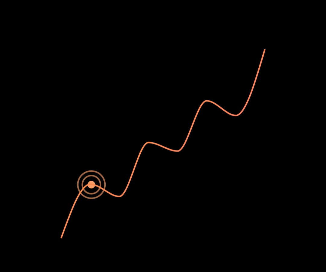
animationConfig={{ duration: 300 }}Line Chart
- For generic string-labeled data — categories and custom labels. Uses
scalePointinternally so all points are evenly spaced. - Supports gradient colours for the curve
- Supports multiple types of curve
Quick Start
import { LineChart } from "rn-cute-charts";
import type { LineDataPoint } from "rn-cute-charts";

const data: LineDataPoint[] = [
  { x: "Week 1", y: 120 },
  { x: "Week 2", y: 145 },
  { x: "Week 3", y: 132 },
];

export default function App() {
  return (
    <LineChart
      width={350}
      height={300}
      chartData={data}
      colors={["#9672f8", "#ff7e5f"]}
      curveType="curveBasis"
      valuePrefix="$"
    />
  );
}
API Reference
| Prop | Type | Default | Description |
|---|---|---|---|
width |
number |
required | Chart canvas width |
height |
number |
required | Chart canvas height |
chartData |
LineDataPoint[] |
required | Array of { x: string, y: number } |
colors |
string[] |
["#000"] |
Gradient colors for the chart line |
curveType |
CurveType |
"curveBasis" |
Curve interpolation type (see below) |
curveStrokeWidth |
number |
2 |
Line stroke width |
curveFill |
"stroke" | "fill" |
"stroke" |
Fill or stroke the path |
valuePrefix |
string |
"" |
Prefix for the displayed value e.g. "$", "€" |
valueTextStyles |
TextStyle |
{} |
Styles for the value label above the chart |
chartContainerStyles |
ViewStyle |
{} |
Styles for the outer container |
cursorComponent |
(props: CursorProps) => ReactElement |
default cursor | Custom cursor component |
If the cursor lands on a point that can't be resolved (bad/missing data), the value label shows
"-"instead of a stale or incorrect number, and the cursor itself stops updating until it's back over valid data.
Time Series Chart
For timestamp-based data (stock prices, sensor data). Uses scaleTime internally so points are spaced proportionally by time distance.
Quick Start
import { TimeSeriesChart } from "rn-cute-charts";
import type { TimeSeriesDataPoint } from "rn-cute-charts";

const data: TimeSeriesDataPoint[] = [
  { x: 1704067200000, y: 150.5 },
  { x: 1704153600000, y: 152.3 },
  { x: 1704240000000, y: 148.7 },
];

export default function App() {
  return (
    <TimeSeriesChart
      width={350}
      height={300}
      chartData={data}
      colors={["#3b82f6", "#8b5cf6"]}
      curveType="curveBumpX"
    />
  );
}
API Reference
| Prop | Type | Default | Description |
|---|---|---|---|
width |
number |
required | Chart canvas width |
height |
number |
required | Chart canvas height |
chartData |
TimeSeriesDataPoint[] |
required | Array of { x: number, y: number } where x is Unix ms |
colors |
string[] |
["#000"] |
Gradient colors for the chart line |
curveType |
CurveType |
"curveBasis" |
Curve interpolation type |
curveStrokeWidth |
number |
2 |
Line stroke width |
curveFill |
"stroke" | "fill" |
"stroke" |
Fill or stroke the path |
textStyles |
TextStyle |
{} |
Styles for the label above the chart |
chartContainerStyles |
ViewStyle |
{} |
Styles for the outer container |
cursorComponent |
(props: CursorProps) => ReactElement |
default cursor | Custom cursor component |
ySearch |
SearchAlgorithm |
"binarySearchWithInterpolation" |
Algorithm for Y lookup on pan |
valuePrefix |
string |
"" |
Any Prefix to attach to numeric value text |
Same bad-data behaviour as Line Chart: the price label shows
"-"and the cursor freezes on unresolvable points, rather than guessing or showing wrong data.
Line vs Time Series — which to use?
LineChart |
TimeSeriesChart |
|
|---|---|---|
| X-axis data | Any string label | Unix timestamp (ms) |
| Point spacing | Always equal | Proportional to time gap |
| Use case | categories and custom labels | Stock prices, sensor readings |
| X lookup | O(1) direct index | Binary search + interpolation |
Curve Types (both line charts)
| Value | Description |
|---|---|
"curveBasis" |
Smooth bezier (default) |
"curveBumpX" |
Bump curve, good for time-series |
"curveLinear" |
Straight lines between points |
"curveMonotoneX" |
Monotone cubic interpolation |
"natural" |
Natural cubic spline |
Custom Cursor
Both line charts accept a cursorComponent prop:
import { Circle } from "@shopify/react-native-skia";
import type { CursorProps } from "rn-cute-charts";
const CustomCursor = ({ xPos, yPos }: CursorProps) => (
<Circle cx={xPos} cy={yPos} r={8} color="#ff6b6b" />
);
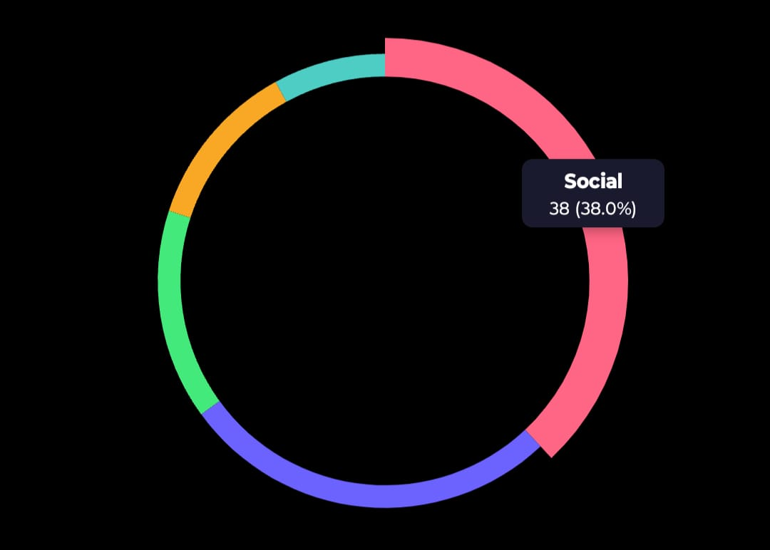
<LineChart {...props} cursorComponent={CustomCursor} />;Pie Chart
Features
- Tap a slice to highlight it (pops out slightly) and show a label bubble with value and percentage
- Donut mode via
donut+innerRadiusRatioprops
Quick Start
import { PieChart } from "rn-cute-charts";
import type { PieDataPoint } from "rn-cute-charts";

const data: PieDataPoint[] = [
  { label: "Sales", value: 40, color: "#FF6B6B" },
  { label: "Support", value: 25, color: "#4ECDC4" },
  { label: "Marketing", value: 20, color: "#45B7D1" },
  { label: "Ops", value: 15, color: "#FFA07A" },
];

export default function App() {
  return <PieChart width={300} height={300} data={data} />;
}
API Reference
| Prop | Type | Default | Description |
|---|---|---|---|
width |
number |
required | Chart width |
height |
number |
required | Chart height |
data |
PieDataPoint[] |
required | Array of { label, value, color } |
donut |
boolean |
false |
Render as a donut chart |
innerRadiusRatio |
number |
0.6 |
Inner hole size as ratio of outer radius (only when donut=true) |
labelBgColor |
string |
"#333" |
Background color of the tap label bubble |
labelFontColor |
string |
"#fff" |
Text color of the tap label bubble |
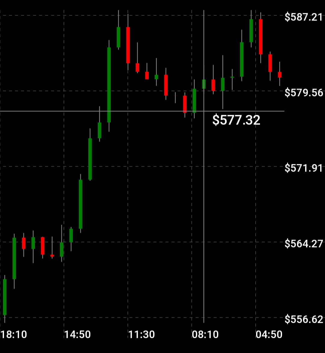
Candlestick Chart
Features
- Single finger crosshair with price label
- Two-finger pinch zoom (constrained between
minVisibleCandlesandmaxVisibleCandles) - Three-finger pan to scroll through history
- Auto-scaling axes (price and time)
- Dashed, solid, or no axis grid lines
Quick Start
import { CandleStickChart } from "rn-cute-charts";
import type { Candle } from "rn-cute-charts";

const data: Candle[] = [
  { timestamp: 1704067200, open: 150.5, high: 152.8, low: 149.2, close: 151.3 },
  { timestamp: 1704070800, open: 151.3, high: 153.5, low: 150.8, close: 152.1 },
];

export default function App() {
  return (
    <CandleStickChart
      width={400}
      height={600}
      data={data}
      fill={["#22c55e", "#ef4444"]}
      bgCol="#0a0a0a"
    />
  );
}
API Reference
| Prop | Type | Default | Description |
|---|---|---|---|
width |
number |
required | Total chart width including axis margins |
height |
number |
required | Total chart height including axis margins |
data |
Candle[] |
required | Array of OHLC candles with Unix second timestamps |
bgCol |
string |
"white" |
Background color |
fill |
[string, string] |
["green","red"] |
Colors for bullish and bearish candles |
currency |
string |
"$" |
Currency symbol for crosshair price label |
labelFontSize |
number |
18 |
Font size for crosshair price label |
labelRightOffset |
number |
96 |
Right offset for crosshair price label |
labelFontCol |
string |
"black" |
Color of crosshair price label |
numLabels |
number |
5 |
Number of labels on each axis |
axisFontColor |
string |
"black" |
Axis label text color |
axisFontSize |
number |
14 |
Axis label font size |
axisLabelRightOffset |
number |
54 |
Space reserved on right for Y-axis labels |
axisLabelBottomOffset |
number |
20 |
Space reserved at bottom for X-axis labels |
axisLinePathEffect |
AxisLinePathEffect |
"dashed" |
Grid line style: "dashed", "line", or "none" |
axisLineColor |
string |
"gray" |
Grid line color |
wickColor |
string |
"rgba(255,255,255,0.6)" |
Candle wick color |
crossHairColor |
string |
"rgba(255,255,255,0.6)" |
Crosshair line color |
maxVisibleCandles |
number |
50 |
Zoom-out limit |
minVisibleCandles |
number |
10 |
Zoom-in limit |
Gesture Controls
| Fingers | Gesture | Action |
|---|---|---|
| 1 | Pan | Crosshair — snaps to nearest candle center |
| 2 | Pinch | Zoom in/out around focal point |
| 3 | Pan | Scroll left/right through history |
Layout
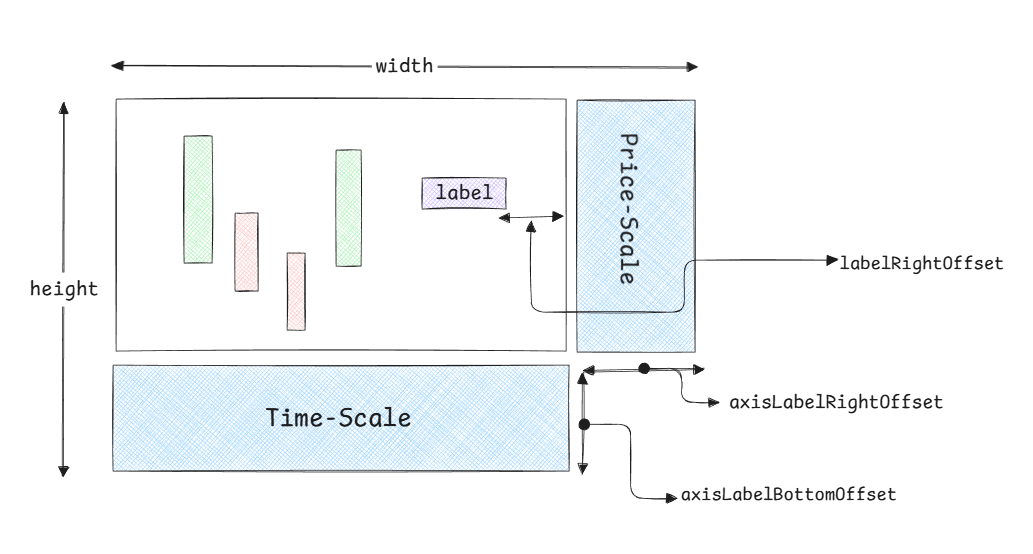
The chart automatically calculates:
- Chart region width =
width - axisLabelRightOffset - Chart region height =
height - axisLabelBottomOffset
Candles and crosshair render inside the chart region. Axes occupy the margin areas.
TypeScript Types
All types are exported from the root import:
import type {
  // Shared bar chart types
  BarDataItem,
  AnimationType,
  AnimationConfig,
  SpringAnimationConfig,
  LinearAnimationConfig,

  // Line / TimeSeries types
  LineDataPoint,
  TimeSeriesDataPoint,
  CurveType,
  SearchAlgorithm,
  YForXResult,
  CursorProps,

  // Pie chart types
  PieDataPoint,

  // Candlestick types
  Candle,
  Domain,
  AxisLinePathEffect,
  CandleStickChartProps,
} from "rn-cute-charts";
To Do
- Mount entry animations for charts
- Easing config prop for linear animation
- Real-time data support for candlestick and timeseries charts
- stacked bar charts
- migrate to gesture handler v3
Contributing
Found a bug or have a feature request? Open an issue on GitHub.
Pull requests are welcome. Follow the existing code style and make sure types are exported.