react-sortable-customizable-table
Sortable and customizable REACT Table v2.0.3
This React module allows you to create a data table with column headers that support ascending/descending sorting. The table is configurable, with customization options for column headers and colors. You can easily integrate it into your project and adjust the styles to meet your needs.
Installation
npm react-sortable-customizable-tableUsage
import React, { useState } from 'react';
import ReactSortableTable from 'react-sortable-customizable-table';

export default function ParentComponent() {

    const [sortColumn, setSortColumn] = useState('');
    const [sortDirection, setSortDirection] = useState('asc');
    const data = [
        { id: 1, name: 'John Doe', position: 'Developer', startDate: '2022-01-01' },
        // other data...
    ];
    const columns = [
        { accessor: 'name', label: 'Name' },
        { accessor: 'position', label: 'Position' },
        { accessor: 'startDate', label: 'Start Date' },
        // other columns...
    ];
        //... your code

    return (
    <>
      //... your code

    <ReactSortableTable
        tableData={data}
        columns={columns}
        headerBgColor="#335123"
        headerTextColor="white"
        headerHoverBgColor="#444"
        headerHoverTextColor="yellow"
        headerActiveBgColor="blue"
        headerActiveTextColor="white"
        evenRowBgColor="blue"
        oddRowBgColor="yellow"
        hoverRowBgColor="#f2f2f2"
        bodyTextColor="pink"
        sortable={true} // set true or false for enable / disable sorting
        dateFormat="MM/dd/yyyy" // Customize date format
      />
        //... your code
    </>
    )
}
Props
| Prop Name | Type | Required | Description |
|---|---|---|---|
tableData |
array | Yes | The data to display in the table. |
columns |
array | Yes | The columns of the table with accessor and label. |
headerBgColor |
string | No | Background color of the column headers. |
headerHoverBgColor |
string | No | Background color of the column headers on hover. |
headerTextColor |
string | No | Text color of the column headers. |
headerHoverTextColor |
string | No | Text color of the column headers on hover. |
headerActiveBgColor |
string | No | Background color of the active sorted column header. |
headerActiveTextColor |
string | No | Text color of the active sorted column header. |
evenRowBgColor |
string | No | Background color of even rows. |
oddRowBgColor |
string | No | Background color of odd rows. |
hoverRowBgColor |
string | No | Background color of rows on hover. |
bodyTextColor |
string | No | Text color of the table cells. |
sortable |
bool | No | Whether the columns are sortable. Defaults to true. |
dateFormat |
string | No | Format to display dates in. Options include 'yyyy-MM-dd', 'MM/dd/yyyy', 'dd/MM/yyyy'. Defaults to 'yyyy-MM-dd'. |
Default style and customization
the default colors are :
- headerBgColor: #fff (white)
- headerTextColor: #000 (black)
- headerHoverBgColor: #f0f0f0 (light gray)
- headerHoverTextColor: #333 (dark gray)
- headerActiveBgColor: #ccc (light gray)
- headerActiveTextColor: #000 (black)
- evenRowBgColor: #f9f9f9 (light gray)
- oddRowBgColor: #bdc3c7 (light gray)
- hoverRowBgColor: #eaeaea (light gray)
- bodyTextColor: #000 (black)
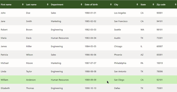
You can customize the table's style using the props, as shown in this (horrible) usage example:
<ReactSortableTable
  tableData={data}
  columns={columns}
  headerBgColor="#335123"
  headerTextColor="white"
  headerHoverBgColor="#444"
  headerHoverTextColor="yellow"
  headerActiveBgColor="blue"
  headerActiveTextColor="white"
  evenRowBgColor="#f2f2f2"
  oddRowBgColor="#fff"
  hoverRowBgColor="#e0e0e0"
  bodyTextColor="black"
  sortable={false} // Set to true, or omit this prop to enable sorting
/>
Custom SVG Icons
The component library includes custom SVG icons that can be used within your React components. This icons can be easily customized.
Icons Props
className(string, optional): CSS class for custom styling. Default are : 'upIcon', 'downIcon', and upDownIcon.width(number, optional): Width of the icon. Default is 64.height(number, optional): Height of the icon. Default is 64.fillColor(string, optional): Color of the icon. Accepts any CSS color value. Default is 'currentColor'
Customization
You can customize the icon's appearance by changing the width, height, and fillColor props. For example, setting fillColor="red" will color the icon red, while width={20} and height={20} will resize the icon to 20x20 pixels.
Note
All icons in the library are SVG-based, which means they are scalable and can be styled with CSS. This ensures that they look sharp on all screen sizes and resolutions.
Licence
This project is licensed under the MIT License. See the LICENSE file for more details.