React Native Circular Progress Indicator
A simple and customizable React Native circular progress indicator component.
This project is inspired from this Youtube tutorial. Do check it out. Special mention at @mironcatalin
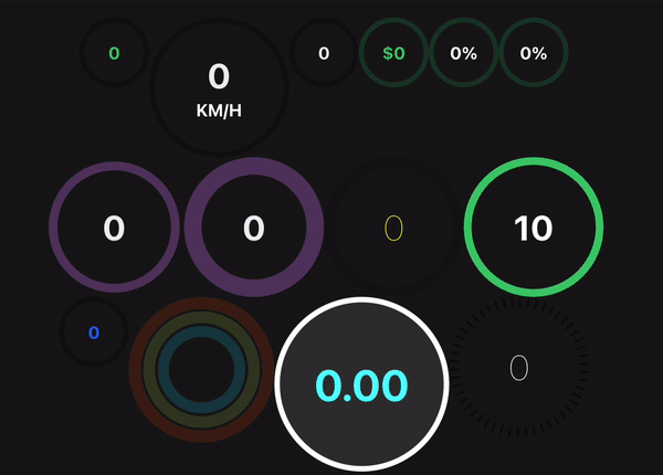
Demo
Try on Expo Snack
Prerequisites
Peer Dependencies
This component has a peer dependency on react-native-reanimated-v2. react-native-reanimated-v2 has to be installed and linked into your project.
Follow react-native-reanimated-v2 to install the dependency.
This component has a peer dependency on react-native-svg to draw the countdown circle. react-native-svg has to be installed and linked into your project.
Follow react-native-svg to install the dependency.
This component has a peer dependency on react-native-redash to make an animation pausable(withPause). react-native-redash has to be installed and linked into your project.
Follow react-native-redash to install the dependency. IMPORTANT: make sure the package version is at-least v15.0.1
Installation
Supported version: react-native >= 0.59.0
npm install react-native-circular-progress-indicatoror
yarn add react-native-circular-progress-indicatorExample
import CircularProgress from 'react-native-circular-progress-indicator';
....
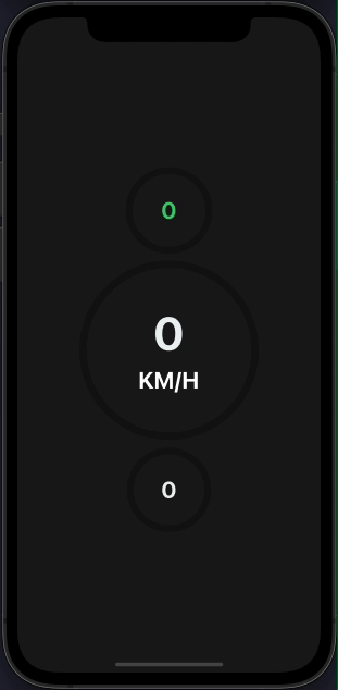
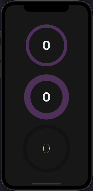
<CircularProgress value={58} />
<CircularProgress
value={60}
radius={120}
duration={2000}
progressValueColor={'#ecf0f1'}
maxValue={200}
title={'KM/H'}
titleColor={'white'}
titleStyle={{fontWeight: 'bold'}}
/>
<CircularProgress
value={60}
activeStrokeWidth={12}
progressValueColor={'#ecf0f1'}
/>
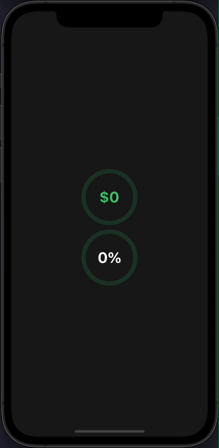
With value prefix/suffix
import CircularProgress from 'react-native-circular-progress-indicator';
....
<CircularProgress
value={90}
valuePrefix={'
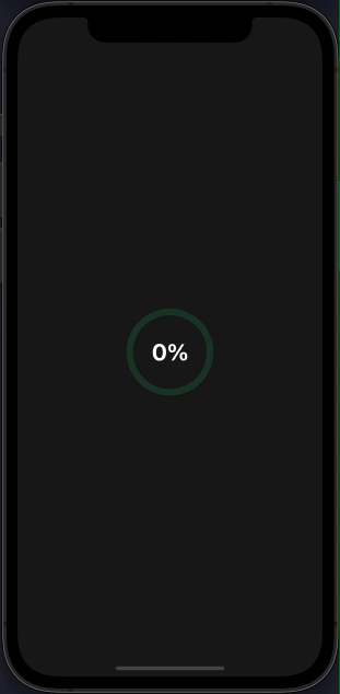
With callback function
import CircularProgress from 'react-native-circular-progress-indicator';
....
<CircularProgress
value={90}
inActiveStrokeColor={'#2ecc71'}
inActiveStrokeOpacity={0.2}
progressValueColor={'#fff'}
valueSuffix={'%'}
onAnimationComplete={() => { alert('callback') }}
/>
Custom
import CircularProgress from 'react-native-circular-progress-indicator';
....
<CircularProgress
value={60}
radius={120}
progressValueColor={'#ecf0f1'}
activeStrokeColor={'#f39c12'}
inActiveStrokeColor={'#9b59b6'}
inActiveStrokeOpacity={0.5}
inActiveStrokeWidth={20}
activeStrokeWidth={40}
/>
<CircularProgress
value={60}
radius={120}
progressValueColor={'#ecf0f1'}
activeStrokeColor={'#f39c12'}
inActiveStrokeColor={'#9b59b6'}
inActiveStrokeOpacity={0.5}
inActiveStrokeWidth={40}
activeStrokeWidth={20}
/>
<CircularProgress
value={60}
radius={120}
inActiveStrokeOpacity={0.5}
activeStrokeWidth={20}
inActiveStrokeWidth={20}
progressValueStyle={{ fontWeight: '100', color: 'yellow' }}
/>
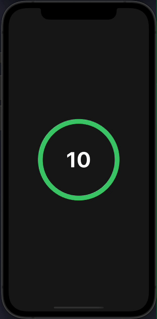
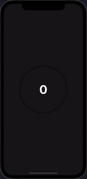
Use as a countdown timer
import CircularProgress from 'react-native-circular-progress-indicator';
....
<CircularProgress
value={0}
radius={120}
maxValue={10}
initialValue={10}
progressValueColor={'#fff'}
activeStrokeWidth={15}
inActiveStrokeWidth={15}
duration={10000}
onAnimationComplete={() => alert('time out')}
/>
With gradient effect
import CircularProgress from 'react-native-circular-progress-indicator';
....
<CircularProgress
value={100}
activeStrokeColor={'#2465FD'}
activeStrokeSecondaryColor={'#C25AFF'}
/>
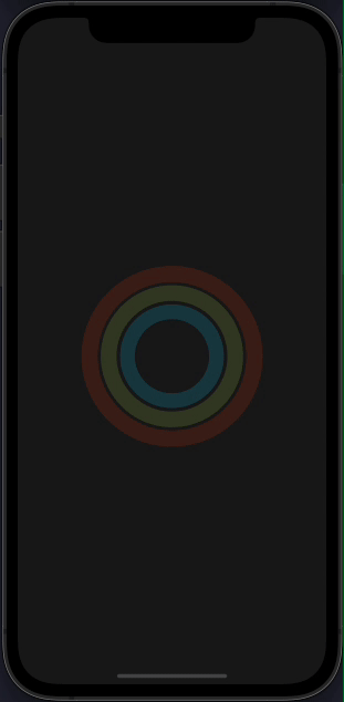
With multiple child
IMPORTANT
CircularProgressWithChild component has been renamed to CircularProgressBase. The CircularProgressWithChild component is still available in the package but will be removed in the
next releases Please use the new CircularProgressBase component instead.
import { CircularProgressBase } from 'react-native-circular-progress-indicator';
// accepts any react element as child
....
const props = {
activeStrokeWidth: 25,
inActiveStrokeWidth: 25,
inActiveStrokeOpacity: 0.2
};
...
<CircularProgressBase
{...props}
value={80}
radius={125}
activeStrokeColor={'#e84118'}
inActiveStrokeColor={'#e84118'}
>
<CircularProgressBase
{...props}
value={87}
radius={100}
activeStrokeColor={'#badc58'}
inActiveStrokeColor={'#badc58'}
>
<CircularProgressBase
{...props}
value={62}
radius={75}
activeStrokeColor={'#18dcff'}
inActiveStrokeColor={'#18dcff'}
/>
</CircularProgressBase>
</CircularProgressBase>
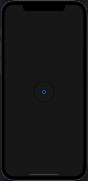
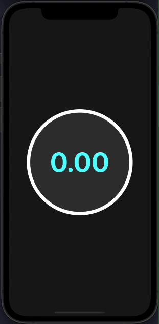
Custom progress formatter function
By default, the progress value is rounded to the nearest integer. If you want to display decimal place values, you can do so by,
import CircularProgress from 'react-native-circular-progress-indicator';
....
<CircularProgress
value={30}
radius={150}
duration={1000}
progressValueColor={'cyan'}
titleFontSize={16}
titleColor={'#333'}
titleStyle={{ fontWeight: 'bold' }}
circleBackgroundColor={'#333'}
activeStrokeColor={'#2465FD'}
activeStrokeSecondaryColor={'#C3305D'}
inActiveStrokeColor={'white'}
progressFormatter={(value: number) => {
'worklet';
return value.toFixed(2); // 2 decimal places
}}
/>
Make sure to mark this function as a worklet function. Read more about worklets at https://docs.swmansion.com/react-native-reanimated/docs/2.2.0/worklets/
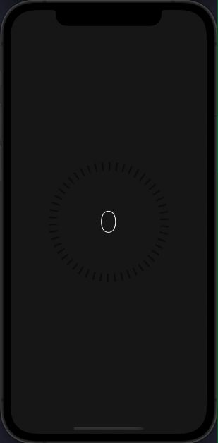
Dashed circular progress
import CircularProgress from 'react-native-circular-progress-indicator';
....
<CircularProgress
value={97}
radius={120}
inActiveStrokeOpacity={0.5}
activeStrokeWidth={15}
inActiveStrokeWidth={20}
progressValueStyle={{ fontWeight: '100', color: 'white' }}
activeStrokeSecondaryColor="yellow"
inActiveStrokeColor="black"
duration={5000}
dashedStrokeConfig={{
count: 50,
width: 4,
}}
/>
Animated stroke color
import CircularProgress from 'react-native-circular-progress-indicator';
....
<CircularProgress
value={100}
radius={120}
progressValueColor={'#fff'}
duration={10000}
strokeColorConfig={[
{ color: 'red', value: 0 },
{ color: 'skyblue', value: 50 },
{ color: 'yellowgreen', value: 100 },
]}
/>
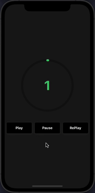
Play, Pause, and ReAnimate
import CircularProgress, { ProgressRef } from 'react-native-circular-progress-indicator';
const progressRef = useRef<ProgressRef>(null);
// to pause animation
progressRef.current.pause();
// to play animation
progressRef.current.play();
// to re-play animation
progressRef.current.reAnimate();
....
<CircularProgress
ref={progressRef}
value={100}
radius={120}
duration={10000}
/>
Props
CircularProgressBase Props
Prop
Description
Type
Default Value
Required
value
progress value
Number
0
true
initialValue
initial progress value. Helpful when used as a countdown timer
Number
0
false
circleBackgroundColor
progress circle background color
String
'transparent'
false
radius
progress circle radius
Number
60
false
activeStrokeWidth
active progress circle stroke width
Number
10
false
inActiveStrokeWidth
inactive progress circle stroke width
Number
10
false
duration
progress animation duration
Number
500
false
delay
progress animation delay
Number
0
false
maxValue
progress maximum value. Percentage calculation is based on the maximum value provided
String
100
false
inActiveStrokeOpacity
inactive progress circle opacity value
Number
1
false
rotation
rotate the progress ring by this value. Accepts a number from -360 to 360
Number
0
false
strokeLinecap
progress stroke line cap
'round' or 'butt' or 'square'
'round'
false
onAnimationComplete
callback when animation is completed.
Function
()=>null
false
activeStrokeColor
active progress circle color
String
'#2ecc71'
false
activeStrokeSecondaryColor
active progress secondary color. Use this to provide a gradient effect
String
''
false
inActiveStrokeColor
inactive progress circle color
String
'rgba(0,0,0,0.3)'
false
clockwise
show ring progress clockwise or anti-clockwise. pass false to enable anti clock-wise
Bool
true
false
dashedStrokeConfig
display the progress circle as dashed lines with customizable stroke count and width.
DashedStrokeConfigType
{ width: 0, count: 0 }
false
strokeColorConfig
animate the progress circle stroke color based on the animation value.
StrokeColorConfigType[]
undefined
false
startInPausedState
render the progress circle initially without any animation.
Bool
false
false
children
any react element
React Element
null
false
CircularProgress Props
CircularProgress component accepts all CircularProgressBase props except the children prop. Along with that, it also accepts the following props.
Prop
Description
Type
Default Value
Required
title
title to display below the progress value
String
''
false
titleStyle
title text style
Object
{}
false
titleColor
title text color
String
false
titleFontSize
title text font size
Number
false
subtitle
subtitle to display below the progress value
String
''
false
subtitleStyle
subtitle text style
Object
{}
false
subtitleColor
subtitle text color
String
false
subtitleFontSize
subtitle text font size
Number
false
progressValueColor
progress value text color
String
false
progressValueStyle
progress value text style
Object
{}
false
progressValueFontSize
progress value text font size
Number
false
inActiveStrokeOpacity
inactive progress circle opacity value
Number
1
false
valuePrefix
prefix value
String
''
false
valueSuffix
suffix value
String
''
false
showProgressValue
show or hide the progress text value
Bool
true
false
progressFormatter
function to format the progress value. Make sure to define it as a worklet function.
Function
(v)=> Math.round(v)
false
allowFontScaling
specifies whether fonts should scale to respect Text Size accessibility settings.
Bool
true
false
valuePrefixStyle
custom styling to value prefix. Use this to customize the styling of the value prefix. If not provided, the progress value style/colors will be used.
TextStyle
{}
false
valueSuffixStyle
custom styling to value suffix. Use this to customize the styling of the value suffix. If not provided, the progress value style/colors will be used.
TextStyle
{}
false
Methods
pause
Imperative method to pause the animation.
progressRef.current.pause();
play
Imperative method to play the animation once paused.
progressRef.current.play();
reAnimate
Imperative method to restart the animation.
progressRef.current.reAnimate();
License
This project is licensed under the MIT License.
}
inActiveStrokeColor={'#2ecc71'}
inActiveStrokeOpacity={0.2}
/>
<CircularProgress
value={85}
inActiveStrokeColor={'#2ecc71'}
inActiveStrokeOpacity={0.2}
progressValueColor={'#fff'}
valueSuffix={'%'}
/>
With callback function
__CODE_BLOCK_4__
Custom
__CODE_BLOCK_5__
Use as a countdown timer
__CODE_BLOCK_6__
With gradient effect
__CODE_BLOCK_7__
With multiple child
IMPORTANT CircularProgressWithChild component has been renamed to CircularProgressBase. The CircularProgressWithChild component is still available in the package but will be removed in the next releases Please use the new CircularProgressBase component instead.
__CODE_BLOCK_8__
Custom progress formatter function
By default, the progress value is rounded to the nearest integer. If you want to display decimal place values, you can do so by,
__CODE_BLOCK_9__Make sure to mark this function as a worklet function. Read more about worklets at https://docs.swmansion.com/react-native-reanimated/docs/2.2.0/worklets/
Dashed circular progress
__CODE_BLOCK_10__
Animated stroke color
__CODE_BLOCK_11__
Play, Pause, and ReAnimate
__CODE_BLOCK_12__
Props
CircularProgressBase Props
| Prop | Description | Type | Default Value | Required |
|---|---|---|---|---|
| value | progress value | Number | 0 | true |
| initialValue | initial progress value. Helpful when used as a countdown timer | Number | 0 | false |
| circleBackgroundColor | progress circle background color | String | 'transparent' | false |
| radius | progress circle radius | Number | 60 | false |
| activeStrokeWidth | active progress circle stroke width | Number | 10 | false |
| inActiveStrokeWidth | inactive progress circle stroke width | Number | 10 | false |
| duration | progress animation duration | Number | 500 | false |
| delay | progress animation delay | Number | 0 | false |
| maxValue | progress maximum value. Percentage calculation is based on the maximum value provided | String | 100 | false |
| inActiveStrokeOpacity | inactive progress circle opacity value | Number | 1 | false |
| rotation | rotate the progress ring by this value. Accepts a number from -360 to 360 | Number | 0 | false |
| strokeLinecap | progress stroke line cap | 'round' or 'butt' or 'square' | 'round' | false |
| onAnimationComplete | callback when animation is completed. | Function | ()=>null | false |
| activeStrokeColor | active progress circle color | String | '#2ecc71' | false |
| activeStrokeSecondaryColor | active progress secondary color. Use this to provide a gradient effect | String | '' | false |
| inActiveStrokeColor | inactive progress circle color | String | 'rgba(0,0,0,0.3)' | false |
| clockwise | show ring progress clockwise or anti-clockwise. pass false to enable anti clock-wise | Bool | true | false |
| dashedStrokeConfig | display the progress circle as dashed lines with customizable stroke count and width. | DashedStrokeConfigType | { width: 0, count: 0 } | false |
| strokeColorConfig | animate the progress circle stroke color based on the animation value. | StrokeColorConfigType[] | undefined | false |
| startInPausedState | render the progress circle initially without any animation. | Bool | false | false |
| children | any react element | React Element | null | false |
CircularProgress Props
CircularProgress component accepts all CircularProgressBase props except the children prop. Along with that, it also accepts the following props.
| Prop | Description | Type | Default Value | Required |
|---|---|---|---|---|
| title | title to display below the progress value | String | '' | false |
| titleStyle | title text style | Object | {} | false |
| titleColor | title text color | String | false | |
| titleFontSize | title text font size | Number | false | |
| subtitle | subtitle to display below the progress value | String | '' | false |
| subtitleStyle | subtitle text style | Object | {} | false |
| subtitleColor | subtitle text color | String | false | |
| subtitleFontSize | subtitle text font size | Number | false | |
| progressValueColor | progress value text color | String | false | |
| progressValueStyle | progress value text style | Object | {} | false |
| progressValueFontSize | progress value text font size | Number | false | |
| inActiveStrokeOpacity | inactive progress circle opacity value | Number | 1 | false |
| valuePrefix | prefix value | String | '' | false |
| valueSuffix | suffix value | String | '' | false |
| showProgressValue | show or hide the progress text value | Bool | true | false |
| progressFormatter | function to format the progress value. Make sure to define it as a worklet function. | Function | (v)=> Math.round(v) | false |
| allowFontScaling | specifies whether fonts should scale to respect Text Size accessibility settings. | Bool | true | false |
| valuePrefixStyle | custom styling to value prefix. Use this to customize the styling of the value prefix. If not provided, the progress value style/colors will be used. | TextStyle | {} | false |
| valueSuffixStyle | custom styling to value suffix. Use this to customize the styling of the value suffix. If not provided, the progress value style/colors will be used. | TextStyle | {} | false |
Methods
__INLINE_CODE_7__ Imperative method to pause the animation.
__CODE_BLOCK_13____INLINE_CODE_8__ Imperative method to play the animation once paused.
__CODE_BLOCK_14____INLINE_CODE_9__ Imperative method to restart the animation.
__CODE_BLOCK_15__License
This project is licensed under the MIT License.