Version 1
- Written from scratch
- Typescript
- Much better API
- Better customizations
- Much better library fundamentals
- Husky Setup
- Commit Linter
- Prettier
Installation
Add the dependency:
npm i react-native-basic-modalPeer Dependencies
IMPORTANT! You need install them
"react-native-modal": ">= 11.4.0"Usage
Import
import BasicModal, { Button } from "react-native-basic-modal";BasicModal Usage
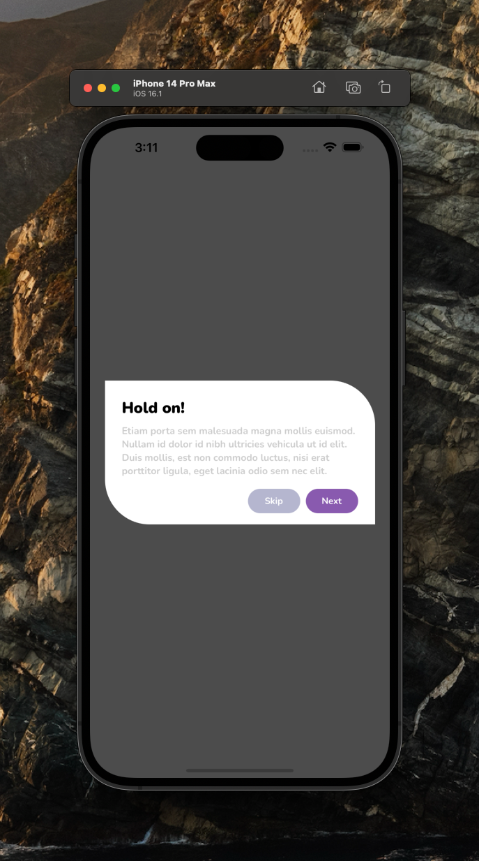
Default Usage
<BasicModal
  isVisible
  title="Hold on!"
  description="Etiam porta sem malesuada magna mollis euismod. Nullam id dolor id nibh."
/>
Advanced Usage with custom header component and custom footer component
<BasicModal
  isVisible
  title="Hold on!"
  description="Etiam porta sem malesuada magna mollis euismod. Nullam id dolor id nibh."
  headerComponent={
    <View>
      <Text>Hey Header</Text>
    </View>
  }
  footerComponent={
    <View>
      <Text>Hey Footer</Text>
    </View>
  }
/>
Advanced Usage with custom buttons
Of course you do not need to use built-in Button component from library. You can put anything into the children
_Note:_If you need to customize the default buttons, you should use this method instead, it will be much easier and customizable
<BasicModal
  isVisible
  title="Hold on!"
  description="Etiam porta sem malesuada magna mollis euismod. Nullam id dolor id nibh.">
  <View style={styles.buttonsContainer}>
    <Button text="Cancel" onPress={() => {}} />
    <Button text="Okay" onPress={() => {}} />
  </View>
</BasicModal>
How can I hide the modal by pressing outside its content?
The prop onBackdropPress allows you to handle this situation:
<BasicModal
  isVisible={this.state.isVisible}
  onBackdropPress={() => this.setState({ isVisible: false })}
/>
For more FAQ about Modal:
Modal FAQ
Example Project
You can check out the example project
Simply run
npm ireact-native run-ios/android
should work of the example project.
Configuration - Props
| Property | Type | Default | Required | Description |
|---|---|---|---|---|
| isVisible | bool | false | set the modal's visibility | |
| title | string | Hold on! | set your own title text | |
| description | string | default | set your own description text | |
| primaryButtonText | string | default | change default primary button's text | |
| secondaryButtonText | string | default | change default secondary button's text | |
| onPrimaryButtonPress | function | default | set the function when the primary button is pressed | |
| onSecondaryButtonPress | function | default | set the function when the secondary button is pressed | |
| onBackdropPress | function | default | set the function when the backdrop of the modal is pressed | |
| headerComponent | component | none | set your own component if you need to add/customize header component | |
| footerComponent | component | none | set your own component if you need to add/customize footer component | |
| style | ViewStyle | default | set/override the default style | |
| modalContainerStyle | ViewStyle | default | set/override the default style | |
| contentContainerStyle | ViewStyle | default | set/override the default style | |
| buttonsContainerStyle | ViewStyle | default | set/override the default style | |
| titleTextStyle | TextStyle | default | set/override the default style | |
| descriptionTextStyle | TextStyle | default | set/override the default style |
Configuration - Props [Button] Component
| Property | Type | Default | Required | Description |
|---|---|---|---|---|
| text | string | Hold on! | set text | |
| style | ViewStyle | default | set/override the default style | |
| onPress | function | default | set the function | |
| textStyle | TextStyle | default | set/override the default style |
Credits
I inspired by Orizon Design Thank you so much guys, nice UI / UX :)
Future Plans
-
LICENSE -
Typescript -
Version 1.0.0 - Write an article about the lib on Medium
Author
FreakyCoder, kurayogun@gmail.com
License
React Native Basic Modal is available under the MIT license. See the LICENSE file for more info.