


The package is currently under development.
You can use this package and experiment with it but major changes may be introduced in future versions.
React - Give Me Map
Give-Me-Map is a library that allows you to add content on a map easily. Using Mapbox as an underlying map provider. The main features:
- Simple to use
- Support many marker types
- Create your content in JSON or draw your map on Mapheim and export it
- Still Provides access to all underlying Mapbox API
Installation
Assuming you have react and react-dom packages already installed, you need to only install the following packages:
npm i react-give-me-map mapbox-gl react-map-glExample
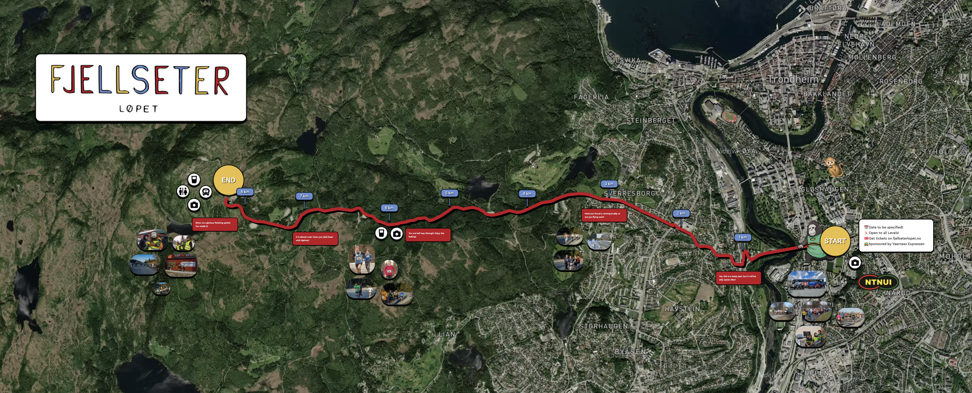
Below you can see a demo created through Mapheim - a map about a running race event in Norway. You can also see a live demo on https://mapheim.com/fjellseterlopet.
Usage
Adding a map
A minimal map to be loaded into your application may look like the code below. This will include the map with a default location and style and without any markers (content).
import * as React from 'react'
import ReactDOM from 'react-dom'
import { GiveMeMap } from 'react-give-me-map';

function App() {
    const [viewport, setViewport] = React.useState({
        latitude: 55.15,
        longitude: 15.02,
        zoom: 4.4
    });

  return (
    <GiveMeMap
      map={{
          mapboxAccessToken: '<MAPBOX_TOKEN_HERE>',
          longitude: viewport.longitude,
          latitude: viewport.latitude,
          zoom: viewport.zoom,
          onMove: (v) => {
            setViewport({
              latitude: v.viewState.latitude,
              longitude: v.viewState.longitude,
              zoom: v.viewState.zoom
            })
          },
          style: {
            width: 1000,
            height: 400
          },
      }}
      config={{
        availableStyles: ['mapbox://styles/koudelka/cl6gs87ey002l15o9gnp7opx7']
      }}
    />)
}

ReactDOM.render(<App />, document.querySelector('#root'))
Adding markers
Manually
To add markers to your map, add a markers parameter and fill it with the right data. An example marker can be seen below:
  const imageMarker: IImageWorldMarker = {
    id: '1',
    lat: 55,
    lng: 16,
    elementType: 'image',
    elementData: {
      src: 'https://relive-story-static-content-email.s3.eu-central-1.amazonaws.com/logo.png',
    }
  }

  <GiveMeMap
    // ...otherAttributes
    markers={[imageMarker]}
  />
Using Mapheim
A nice alternative, and more user friendly is to use Mapheim editor on https://www.mapheim.com/world where you can instantly create a new map and either use your map hosted directly on Mapheim platform, or you can export the marker in a JSON format. And include it as a JSON/variable in your code. See below how to find the export functionality in two steps:

Detail Marker's documentation
Below you can see listed all the market types.
| Marker type | Description |
|---|---|
| Text | Represents a text |
| Image | Renders an image |
| Draw | Renders a pencil/pen drawing |
| Pin | Renders a simple fixed-size marker that is represented by Image, Pin or Emoji |
| Polygon | Represents a drawing of the polygon with multiple points |
| Direction | Represents a path computed between selected points on the map |
| Youtube | Renders a Youtube video that can be played |
| Link | Renders a link to the external web including it's favicon |
Common marker attributes
| Attribute | Type | Required | Default | Description |
|---|---|---|---|---|
| id | string | required | - | Unique identifier of the marker |
| lat | number | required | - | Latitude position of the marker on the map |
| lng | number | required | - | Longitude position of the marker on the map |
| elementType | enum | required | - | Defines the type of market. One of text, image, draw, pin, polygon, direction, youtube, link |
| elementData | object | required | - | Defines the data of the marker, accepts different values dependent on the elementType, see the sections below for more information what is the structure |
| scalable | boolean | optional | true | Indicates if the marker will scale when the map is zoomed in/out |
| scale | number | optional | 1 | Defines the number that scales the marker > 1 to increase the size of the marker, < 1 to decrease the size of the marker |
| order | number | optional | false | defines if the marker is in front/behind other markers. Higher the value, the more in front the marker is |
Text marker
| Attribute | Type | Required | Default | Description |
|---|---|---|---|---|
| text | string | required | - | Text content of the marker |
| width | number | required | - | Defines the width of the marker. The text breaks after the given width |
| fill | number | required | - | Defines if the marker is filled with background, otherwise background is transparent |
| color | string | required | - | Background color of the marker in hexadecimal format |
| textColor | string | optional | white | Text color |
| borderRadiusPx | number | optional | 0 | Defines the border-radius style of the element in pixels |
| borderSize | number | optional | 0 | Defines the border-size style of the element in pixels |
| borderColor | string | optional | black | Defines the border-color style of the element |
| dropShadowCombined | string | optional | empty | Defines the box-shadow style of the element |
| textShadow | string | optional | 1px 1px 2px rgba(0, 0, 0, 0.5) when fill=false, otherwise gamma is 0.25 |
Defines the box-shadow style of the element |
Image marker
| Attribute | Type | Required | Default | Description |
|---|---|---|---|---|
| src | string | required | - | URL of the image to render |
| borderRadiusPx | number | optional | 0 | Defines the border-radius style of the element in pixels |
| borderSize | number | optional | 0 | Defines the border-size style of the element in pixels |
| borderColor | string | optional | black | Defines the border-color style of the element |
| dropShadowCombined | string | optional | empty | Defines the box-shadow style of the element |
Link marker
| Attribute | Type | Required | Default | Description |
|---|---|---|---|---|
| link | string | required | - | URL of the external website to redirect to when the marker is clicked |
| text | string | required | - | Text content of the marker |
| width | number | required | - | Defines the width of the marker. The text breaks after the given width |
| color | string | required | - | Background color of the marker in hexadecimal format. Text color is determined automatically |
| borderRadiusPx | number | optional | 0 | Defines the border-radius style of the element in pixels |
| borderSize | number | optional | 0 | Defines the border-size style of the element in pixels |
| borderColor | string | optional | black | Defines the border-color style of the element |
| dropShadowCombined | string | optional | empty | Defines the box-shadow style of the element |
Draw marker
| Attribute | Type | Required | Default | Description |
|---|---|---|---|---|
| type | enum | required | - | One of pen, brush value. The value pen will render a sharp link, while brush will render a line that is not sharp and is more suitable for highlighting |
| path | string | required | - | The definition of the line as a svg path. You can learn more about here. |
| width | number | required | - | |
| height | number | required | - | Defines the height of the marker |
| opacity | number | required | - | Defines the opacity style of the element. Accepts values between 0 and 1 |
| strokeWidth | number | required | - | Defines the width of the drawn line |
| color | string | required | - | Defines the color of the drawn line |
| fill | boolean | required | - | Defines is the drawn shape should be filled in with the same color as the line |
Pin marker
| Attribute | Type | Required | Default | Description |
|---|---|---|---|---|
| label | string | optional | - | Defines text that is displayed next to the pin |
| img | string | optional | - | |
| emoji | string | optional | - | Defines content of the pin. Accepts a single character to be rendered as the pin. When set, the img and dotColor should not be set |
| dotColor | string | optional | - | Defines content of the pin. Accepts the color that the pin will be filled with. When set, the img and emoji should not be set |
Polygon marker
| Attribute | Type | Required | Default | Description |
|---|---|---|---|---|
| path | string | required | - | |
| coordinates | array of objects | required | - | Array of objects in the shape { lat: number; lng: number }. It defines all the vertices (points) of the polygon |
| width | number | required | - | Width of the line the polygon is drawn with |
| height | number | required | - | ??? |
| color | string | required | - | Color of the polygon |
| fill | boolean | optional | false |
Direction marker
| Attribute | Type | Required | Default | Description |
|---|---|---|---|---|
| start | object | required | - | An object that defines the start of the route defined as { lat: number; lng: number } |
| end | object | required | - | An object that defines the end of the route defined as { lat: number; lng: number } |
| coordinates | array of objects | required | - | Array of objects in the shape { lat: number; lng: number } that are rendered in between start and end points |
| transport | enum | required | - | One of 'driving-traffic, driving, walking, cycling, plane to define the type of transportation that the route is computed for. |
| lineColor | string | required | - | Color of the line that is rendered |
| lineOpacity | number | required | - | Defines the opacity style of the line |
| dropShadowColor | string | optional | empty | Defines the box-shadow style of the element |
Youtube marker
| Attribute | Type | Required | Default | Description |
|---|---|---|---|---|
| video | string | required | - | Youtube video identifier or a full video URL |
| borderRadiusPx | number | optional | 0 | Defines the border-radius style of the element in pixels |
| borderSize | number | optional | 0 | Defines the border-size style of the element in pixels |
| borderColor | string | optional | black | Defines the border-color style of the element |
| dropShadowCombined | string | optional | empty | Defines the box-shadow style of the element |
Feedback
If you're having trouble implementing Give Me Map, check out GitHub issues or create a new GitHub issue.