Raqam
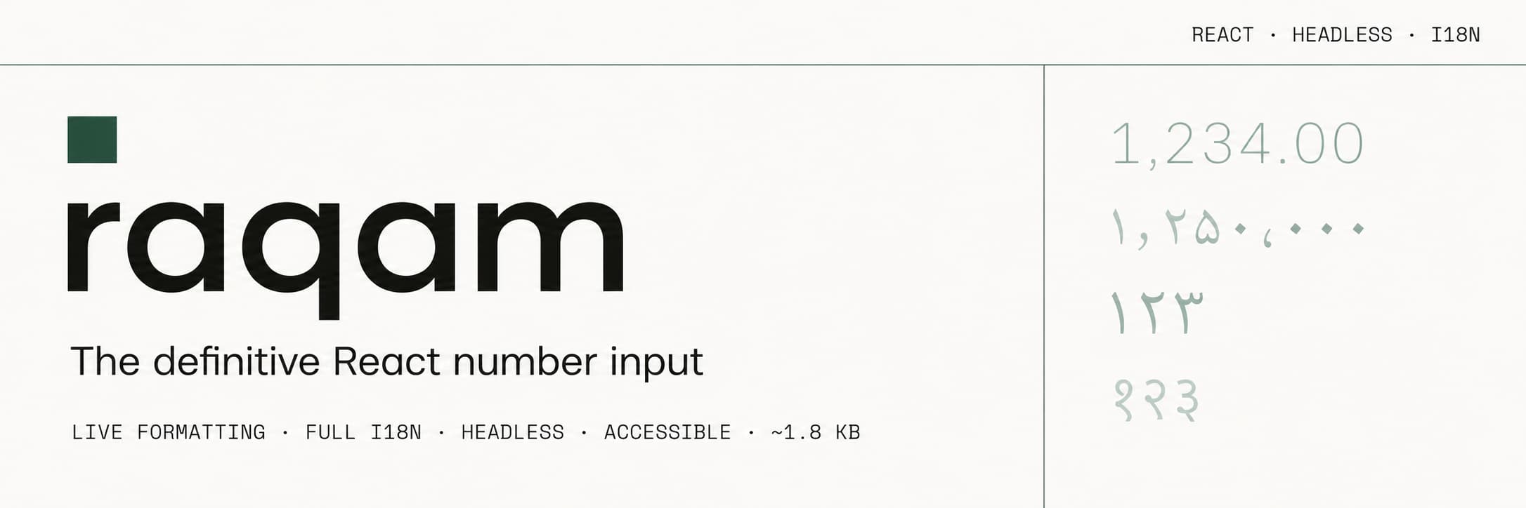
The definitive React number input: live formatting, full i18n, headless, accessible.


Why raqam?
| Feature | Base UI | React Aria | Mantine | raqam |
|---|---|---|---|---|
| Live formatting while typing | blur | blur | ||
| Truly headless | ||||
| i18n digit input (Persian ۱۲۳, Arabic ١٢٣…) | ||||
| WAI-ARIA spinbutton | ||||
| Bundle size | ~10 KB | ~30 KB | ~60 KB | ~2.2 KB core |
No existing package combines all four. raqam does.
Installation
npm install raqam
# or
pnpm add raqam
Peer dependencies: React 18 or 19.
Quick start
Hook API
import { useNumberFieldState, useNumberField, type UseNumberFieldStateOptions } from 'raqam'
import { useRef } from 'react'

function PriceInput() {
  // Share one options object — useNumberField builds its own formatter/parser,
  // so it needs the same formatting options as useNumberFieldState. `satisfies`
  // keeps the literal types (e.g. style: 'currency') in a strict TS project.
  const options = {
    locale: 'en-US',
    formatOptions: { style: 'currency', currency: 'USD' },
    minValue: 0,
    defaultValue: 1234.56,
  } satisfies UseNumberFieldStateOptions
  const state = useNumberFieldState(options)
  const inputRef = useRef(null)
  const { inputProps, labelProps, incrementButtonProps, decrementButtonProps } =
    useNumberField({ ...options, label: 'Price' }, state, inputRef)

  return (
    <div>
      <label {...labelProps}>Price</label>
      <button {...decrementButtonProps}>−</button>
      <input ref={inputRef} {...inputProps} />
      <button {...incrementButtonProps}>+</button>
    </div>
  )
}
Headless Component API
import { NumberField } from 'raqam'

function PriceField() {
  return (
    <NumberField.Root
      locale="en-US"
      formatOptions={{ style: 'currency', currency: 'USD' }}
      defaultValue={1234.56}
      minValue={0}
      onValueChange={(value, { reason }) => console.log(value, reason)}
    >
      <NumberField.Label>Price</NumberField.Label>
      <NumberField.Group>
        <NumberField.Decrement>−</NumberField.Decrement>
        <NumberField.Input />
        <NumberField.Increment>+</NumberField.Increment>
      </NumberField.Group>
      <NumberField.Description>Enter the product price</NumberField.Description>
      <NumberField.ErrorMessage />
    </NumberField.Root>
  )
}
Format presets
import { presets, NumberField } from 'raqam'

<NumberField.Root formatOptions={presets.currency('USD')} />           // $1,234.56
<NumberField.Root formatOptions={presets.accounting('USD')} />         // (1,234.56)
<NumberField.Root formatOptions={presets.percent} />                   // 12.3%
<NumberField.Root formatOptions={presets.compact} />                   // 1.2K
<NumberField.Root formatOptions={presets.scientific} />                // 1.23E3
<NumberField.Root formatOptions={presets.integer} />                   // 1,234
<NumberField.Root formatOptions={presets.financial} fixedDecimalScale /> // 1,234.00
<NumberField.Root formatOptions={presets.unit('kilometer-per-hour')} /> // 120 km/h
Locales & i18n
Persian input with native digits — just import the plugin and set the locale:
import 'raqam/locales/fa'  // registers ۰–۹ digit normalization (< 200 B)
import { NumberField } from 'raqam'

<NumberField.Root
  locale="fa-IR"
  formatOptions={{ style: 'currency', currency: 'IRR' }}
  suffix=" تومان"
/>
// user types ۱۲۳۴, raqam parses and formats it correctly in real-time
Supported scripts: Persian fa, Arabic ar, Bengali bn, Hindi hi, Thai th. RTL is auto-detected and handled.
Custom validation
<NumberField.Root
  minValue={0}
  validate={(value) => {
    if (value === null) return 'Required'
    if (value % 2 !== 0) return 'Must be an even number'
    return true
  }}
>
  <NumberField.Input />
  <NumberField.ErrorMessage /> {/* auto-renders the validate() error string */}
</NumberField.Root>
Display-only formatting
import { useNumberFieldFormat } from 'raqam'

function PriceDisplay({ price }: { price: number }) {
  const formatted = useNumberFieldFormat(price, {
    locale: 'en-US',
    formatOptions: { style: 'currency', currency: 'USD' },
  })
  return <span>{formatted}</span>  // "$1,234.56"
}
Works in React Server Components too via raqam/server:
import { createFormatter } from 'raqam/server'  // zero React deps

const formatter = createFormatter({
  locale: 'en-US',
  formatOptions: { style: 'currency', currency: 'USD' },
})
const displayPrice = formatter.format(1234.56)  // "$1,234.56"
SSR / hydration notes
- Pin
localefor SSR. With nolocale, formatting uses the runtime default — the browser locale on the client but the host's ICU/OS locale on the server. If they differ, the server-rendered value won't match the first client render and React logs a hydration mismatch. Pass an explicitlocale(the same on both sides) whenever you server-render an initial value. - Label/description ARIA wires up after mount.
<NumberField.Label>is associated with the input via the nativehtmlFor/idin the SSR HTML (screen readers honor it), but the redundantaria-labelledby(andaria-describedbyfor<NumberField.Description>) are attached on the client after the label/description registers — they appear post-hydration, not in the static HTML.
ScrubArea (drag to change value)
<NumberField.Root defaultValue={50} minValue={0} maxValue={100}>
  <NumberField.ScrubArea direction="horizontal" pixelSensitivity={2}>
    <NumberField.Label>Opacity</NumberField.Label>
    <NumberField.ScrubAreaCursor>⟺</NumberField.ScrubAreaCursor>
  </NumberField.ScrubArea>
  <NumberField.Input />
</NumberField.Root>
Uses the Pointer Lock API so the cursor never hits the screen edge during drag.
CSS styling with data attributes
/* All state-based styling — no JS needed */
[data-focused]   { outline: 2px solid blue; }
[data-invalid]   { border-color: red; }
[data-disabled]  { opacity: 0.5; }
[data-readonly]  { background: #f5f5f5; }
[data-required]  { /* required-field styling */ }
[data-scrubbing] { cursor: ew-resize; }
[data-rtl] { /* RTL-specific overrides (set on the input element) */ }data-focused, data-invalid, data-disabled, data-readonly, data-required,
and data-scrubbing are set on NumberField.Root; data-rtl (plus the state
attributes) is set on the NumberField.Input element.
react-hook-form integration
import { Controller } from 'react-hook-form'
import { NumberField } from 'raqam'

<Controller
  name="price"
  control={control}
  render={({ field, fieldState }) => (
    <NumberField.Root
      value={field.value}
      onChange={field.onChange}
      onBlur={field.onBlur}
      validate={() => fieldState.error?.message ?? true}
    >
      <NumberField.Label>Price</NumberField.Label>
      <NumberField.Input />
      <NumberField.ErrorMessage />
    </NumberField.Root>
  )}
/>
Arbitrary-precision string mode
For financial apps that need to avoid IEEE 754 float rounding:
<NumberField.Root
  onRawChange={(rawValue) => {
    // rawValue is the unformatted, precision-preserving numeric string
    // (grouping / currency / prefix / suffix stripped, locale decimal
    // normalized to ".", typed trailing zeros kept) — full precision beyond
    // JS float. e.g. "0.1000000001" — feed it to your BigDecimal library
    myDecimal.set(rawValue)
  }}
/>
Also available as state.rawValue from the hook API.
Custom formatter / parser
import Decimal from 'decimal.js'

<NumberField.Root
  formatValue={(value) => new Decimal(value).toFixed(8)}
  parseValue={(input) => {
    try {
      return { value: new Decimal(input).toNumber(), isIntermediate: false }
    } catch {
      return { value: null, isIntermediate: input.endsWith('.') }
    }
  }}
/>
API Reference
useNumberFieldState(options)
State management hook — returns NumberFieldState.
| Prop | Type | Default | Description |
|---|---|---|---|
value |
number | null |
— | Controlled value |
defaultValue |
number | null |
— | Uncontrolled default |
onChange |
(value: number | null) => void |
— | Fires whenever the parsed numeric value changes |
onRawChange |
(raw: string | null) => void |
— | Fires with raw unformatted string |
locale |
string |
browser | BCP 47 locale tag |
formatOptions |
Intl.NumberFormatOptions |
{} |
Full Intl options |
minValue |
number |
— | Minimum value |
maxValue |
number |
— | Maximum value |
step |
number |
1 |
Arrow key step |
largeStep |
number |
step × 10 |
Shift+Arrow step |
smallStep |
number |
step × 0.1 |
Ctrl/Meta+Arrow step |
clampBehavior |
"blur" | "strict" | "none" |
"blur" |
When to clamp to min/max |
allowNegative |
boolean |
true |
Allow negative values |
allowDecimal |
boolean |
true |
Allow decimal values |
fixedDecimalScale |
boolean |
false |
Always show max decimal places |
allowOutOfRange |
boolean |
false |
Skip clamping (server-side validation) |
validate |
(v: number | null) => boolean | string | null |
— | Custom validation |
prefix |
string |
— | String prefix (e.g. "$") |
suffix |
string |
— | String suffix (e.g. " تومان") |
liveFormat |
boolean |
true |
Format while typing (disable for IME locales) |
disabled |
boolean |
false |
Disable the field |
readOnly |
boolean |
false |
Read-only mode |
required |
boolean |
false |
Mark the field as required |
Also accepts maximumFractionDigits, minimumFractionDigits, formatValue,
and parseValue — see the full options reference.
useNumberField(props, state, inputRef)
Behavior hook — returns NumberFieldAria prop objects for each element. Accepts
every useNumberFieldState option plus the behavior-only props below:
| Prop | Type | Default | Description |
|---|---|---|---|
allowMouseWheel |
boolean |
false |
Mouse wheel to increment/decrement |
copyBehavior |
"formatted" | "raw" | "number" |
"formatted" |
Clipboard content on copy |
stepHoldDelay |
number |
400 |
Press-and-hold initial delay (ms) |
stepHoldInterval |
number |
200 |
Press-and-hold repeat interval (ms) |
label / name / id / aria-* |
string |
— | Labelling, form name, and id wiring |
→ Full reference: useNumberField.
NumberField.Root extra props
| Prop | Type | Description |
|---|---|---|
onValueChange |
(value, { reason, formattedValue }) => void |
Fires on every change, with the change reason |
onValueCommitted |
(value, { reason }) => void |
Fires only on commit (reason: "blur" | "keyboard") |
className / style |
string / CSSProperties |
Applied to the root wrapper <div> |
useNumberFieldFormat(value, options)
Display-only formatting hook (client-only — it carries "use client"). Returns a
formatted string with zero state overhead. For React Server Components, SSR, or
Edge, use createFormatter from raqam/server instead (shown above).
NumberField.* components
| Component | Description |
|---|---|
Root |
Context provider + state orchestration |
Label |
<label> with correct htmlFor wiring |
Group |
<div role="group"> for input + buttons |
Input |
<input type="text" role="spinbutton"> with live formatting |
Increment |
Increment button with press-and-hold acceleration |
Decrement |
Decrement button with press-and-hold acceleration |
HiddenInput |
Hidden <input> for native FormData submission |
ScrubArea |
Pointer Lock drag-to-adjust area |
ScrubAreaCursor |
Custom cursor rendered during pointer lock |
Description |
Help text linked via aria-describedby |
ErrorMessage |
Error display with role="alert" |
Formatted |
Read-only formatted value display span |
Every component accepts a render prop for element replacement:
<NumberField.Increment render={<MyIconButton />}>▲</NumberField.Increment>
// or with state access:
<NumberField.Increment render={(props, state) => (
  <MyBtn disabled={!state.canIncrement} {...props} />
)} />
Bundle size
Measured min + brotli (including dependencies), enforced in CI via
.size-limit.json:
| Entry | Size | CI budget |
|---|---|---|
raqam/core |
~2.23 KB | 2.5 KB |
raqam (hooks + components) |
~9.62 KB | 12 KB |
raqam/react |
~9.42 KB | 10 KB |
raqam/locales/fa |
196 B | 0.3 KB |