ngx-pass-code
A reactive Angular custom form control for OTP / pass-code input — one box
per character, with validation, autofocus, autoblur and paste-anywhere support.
Built on Angular 21 Signal Forms (FormValueControl) with no
ControlValueAccessor, no Angular Material, no third-party runtime
dependencies.


Live demo · Stackblitz · Changelog
Features
- One input box per character
- Plug & play with Angular Signal Forms via
FormValueControl([formField]) - Ships
passCodeComplete(path, length)— opinionated exact-length validator composable into anyform()schema - Schema-driven validation (
required,pattern,validate, …) owned by the consumer'sform() - Keyboard navigation: auto next/previous, backspace, arrow keys
- Paste anywhere — fills left-to-right, sanitizes per
type, truncates tolength, focuses the first empty slot (or blurs whenautoblur) - Autofocus the first input, autoblur the last input on completion
- Three input modes:
text,number,password(masked) - Standalone component — no NgModule required in consumer apps
- Tree-shakable (
sideEffects: false) - Zero runtime dependencies
@angular/forms/signalsis marked@experimental 21.0.0. Consumers ofngx-pass-code@2.xadopt the same experimental surface.
At a glance
Empty (autofocused)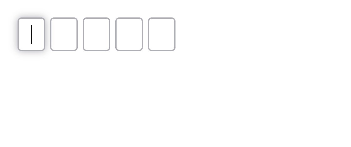 |
Text code |
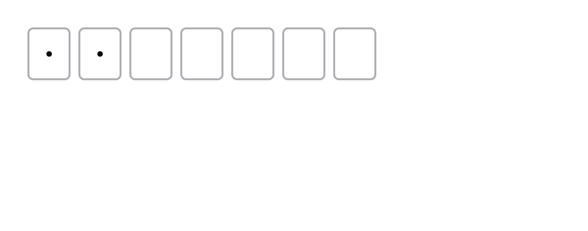
Number PIN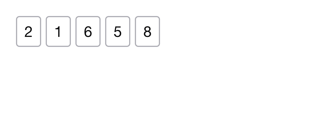 |
Password (masked)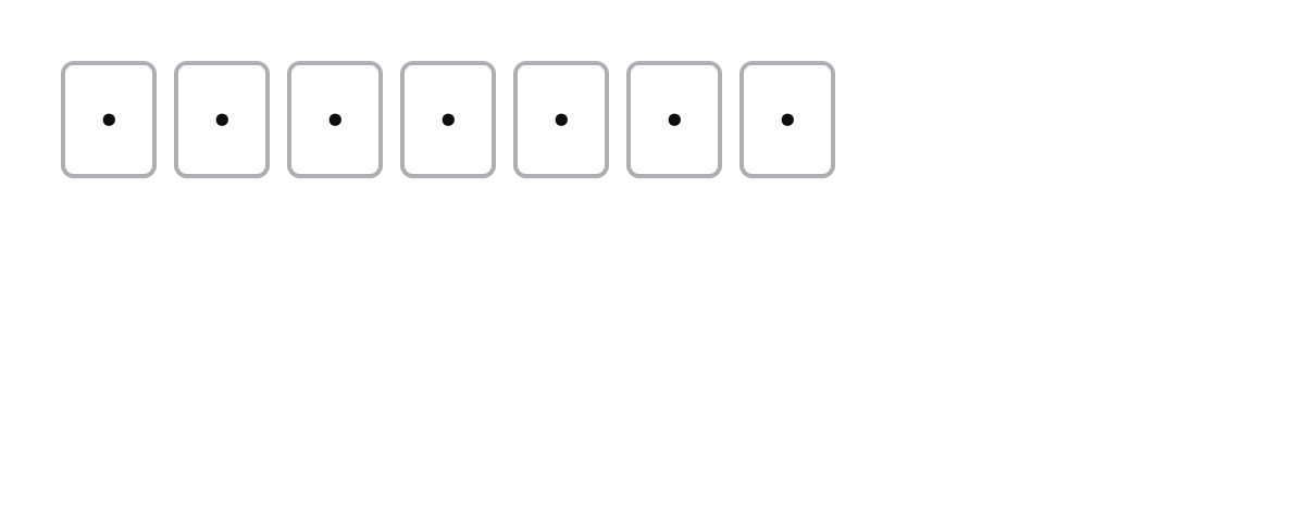 |
Install
npm install ngx-pass-codeAngular compatibility
| Library version | Angular | Forms API |
|---|---|---|
1.x |
>=12 <18 |
Reactive Forms (ControlValueAccessor) |
2.x |
>=21 <22 |
Signal Forms (FormValueControl) |
Peer dependencies for 2.x: @angular/common, @angular/core,
@angular/forms >=21.0.0 <22.0.0, rxjs ^7.8.0.
Usage
PassCodeComponent implements the Signal Forms
FormValueControl<string | number | null> contract. Bind it with [formField]
to a field produced by form():
import { Component, signal } from '@angular/core'
import { form, pattern, FormField } from '@angular/forms/signals'
import { PassCodeComponent, passCodeComplete } from 'ngx-pass-code'

@Component({
  selector: 'app-login',
  imports: [PassCodeComponent, FormField],
  template: `
    <ngx-pass-code
      [formField]="codeForm"
      [length]="5"
      type="text"
      [uppercase]="true"
      [autofocus]="true"
    />
  `
})
export class LoginComponent {
  protected readonly code = signal<string | number | null>(null)
  protected readonly codeForm = form<string | number | null>(this.code, p => {
    passCodeComplete(p, 5)
    pattern(p as never, /^[A-Z0-9]{5}$/)
  })
}
The component does not run validators itself; it forwards the field's errors
and touched state to the UI and flips to the invalid-input class only once
both are present. Validation rules (passCodeComplete, pattern, custom
validate(...)) live in your form() schema.
Inputs
All inputs are signal inputs (input()):
| Input | Type | Default | Description |
|---|---|---|---|
length |
number (required) |
— | Number of individual input boxes to render. |
type |
'text' | 'number' | 'password' |
'text' |
Input type. 'password' hides inserted characters. Used to cast the emitted control value. |
uppercase |
boolean |
false |
Uppercase-transform displayed value and control value. |
autofocus |
boolean |
false |
Focus the first input on render. |
autoblur |
boolean |
false |
Remove focus from the last input once it is filled. |
autocomplete |
string |
'' |
Mirrored to the autocomplete attribute on every slot. Use 'one-time-code' to opt into Safari/iOS SMS-OTP autofill. Empty string = no attribute. |
inputmode |
'text' | 'numeric' | 'decimal' | 'tel' | 'search' | 'email' | 'url' | 'none' |
'' |
Mirrored to the inputmode attribute on every slot. Use 'numeric' to get the digits-only on-screen keyboard on mobile. Empty string = no attribute. |
The value (model signal), touched (model signal), disabled, and errors
properties are bound automatically by the [formField] directive from the
parent form(). You can still bind [(value)] directly if you are not using
Signal Forms.
SMS one-time-code autofill
<ngx-pass-code
  [formField]="codeForm"
  [length]="6"
  type="text"
  inputmode="numeric"
  autocomplete="one-time-code"
/>
autocomplete="one-time-code" lets Safari/iOS surface the OTP straight from the
SMS notification. Pair with inputmode="numeric" on mobile to get the digit
keypad without forcing type="number" (which drops leading zeros — see note
below).
Numeric mode and leading zeros
type="number" casts the control value to a JavaScript number, so a code like
01234 is emitted as 1234 and re-rendered into 4 slots, not 5. For PIN or OTP
flows where leading zeros must be preserved, prefer:
<ngx-pass-code
  [formField]="codeForm"
  [length]="6"
  type="text"
  inputmode="numeric"
  autocomplete="one-time-code"
/>
type="text" keeps the value a string ('012345'), inputmode="numeric"
still gives the digit-only keypad on mobile, and paste-anywhere stripping is
unchanged for the text mode.
Theming
All visual properties of the slot inputs are exposed as CSS custom properties on
the component host. Override them with any CSS selector that targets
ngx-pass-code — no ::ng-deep needed.
| Custom property | Default |
|---|---|
--ngx-pass-code-slot-width |
44px |
--ngx-pass-code-slot-min-width |
32px |
--ngx-pass-code-slot-height |
54px |
--ngx-pass-code-slot-gap |
4px |
--ngx-pass-code-slot-radius |
6px |
--ngx-pass-code-slot-bg |
transparent |
--ngx-pass-code-color |
#0c0c0d |
--ngx-pass-code-border-color |
#aeaeb5 |
--ngx-pass-code-border-width |
2px |
--ngx-pass-code-invalid-color |
#b90d0d |
--ngx-pass-code-font-family |
'Helvetica Neue', Arial, sans-serif |
--ngx-pass-code-font-size |
1.75rem |
--ngx-pass-code-font-weight |
400 |
ngx-pass-code {
  --ngx-pass-code-slot-width: 56px;
  --ngx-pass-code-slot-height: 64px;
  --ngx-pass-code-border-color: #4a90e2;
  --ngx-pass-code-invalid-color: #e94e3b;
}
Validation
Validation is entirely driven by the consumer's form() schema. The library
ships passCodeComplete(path, length) for the common "every slot must be
filled" rule — Signal Forms' required only checks non-nullish, so a partially
filled control would otherwise report Valid.
import { passCodeComplete } from 'ngx-pass-code'
import { form, pattern } from '@angular/forms/signals'

form(code, p => {
  passCodeComplete(p, 5) // all 5 slots filled
  pattern(p as never, /^[A-Z0-9]{5}$/) // charset
})
passCodeComplete emits a { kind: 'incomplete' } error when the concatenated
value is shorter than length.
Public directives
PassCodeComponent is the recommended entry point — it imports the directives
below internally. They are also exported from the package barrel for advanced
use cases (e.g. building your own slot layout):
| Symbol | Selector | Purpose |
|---|---|---|
AutofocusFirstInputDirective |
[autofocusFirstInput] |
On AfterViewInit, focuses the first descendant <input> when its autofocus input is true. |
FocusNextPreviousInputDirective |
[focusNextPreviousInput] |
Per-slot keyboard navigation — advances on filled, retreats on Backspace/Delete/ArrowLeft, optional autoblur. |
TransformInputValueDirective |
[transformInputValue] |
Toggles text-transform: uppercase on the host input when its uppercase input is true. |
These directives assume sibling <input> elements with maxlength="1". Any
restructuring of the slot layout must preserve that contract.
Contributing
Development happens in the parent monorepo — see ngx-libs-workspace for setup, local commands, and contribution guidelines.
Releasing
Releases are automated via
release-please driven by
Conventional Commits. Merging a feat: / fix: / feat!: commit to main
opens or updates a release PR; merging the release PR creates a GitHub Release +
tag ngx-pass-code@x.y.z which triggers
publish-ngx-pass-code.yml
to run npm publish --provenance --access public.
Local dry-run:
pnpm ngx-pass-code:publish:dry-runLicense
MIT Dino Klicek