kon-iro 紺色
A Japanese-traditional (和色 wairo) design theme. Deep indigo on dark, warm washi-paper on light — a small, opinionated palette and type system you can drop into any web or app project.
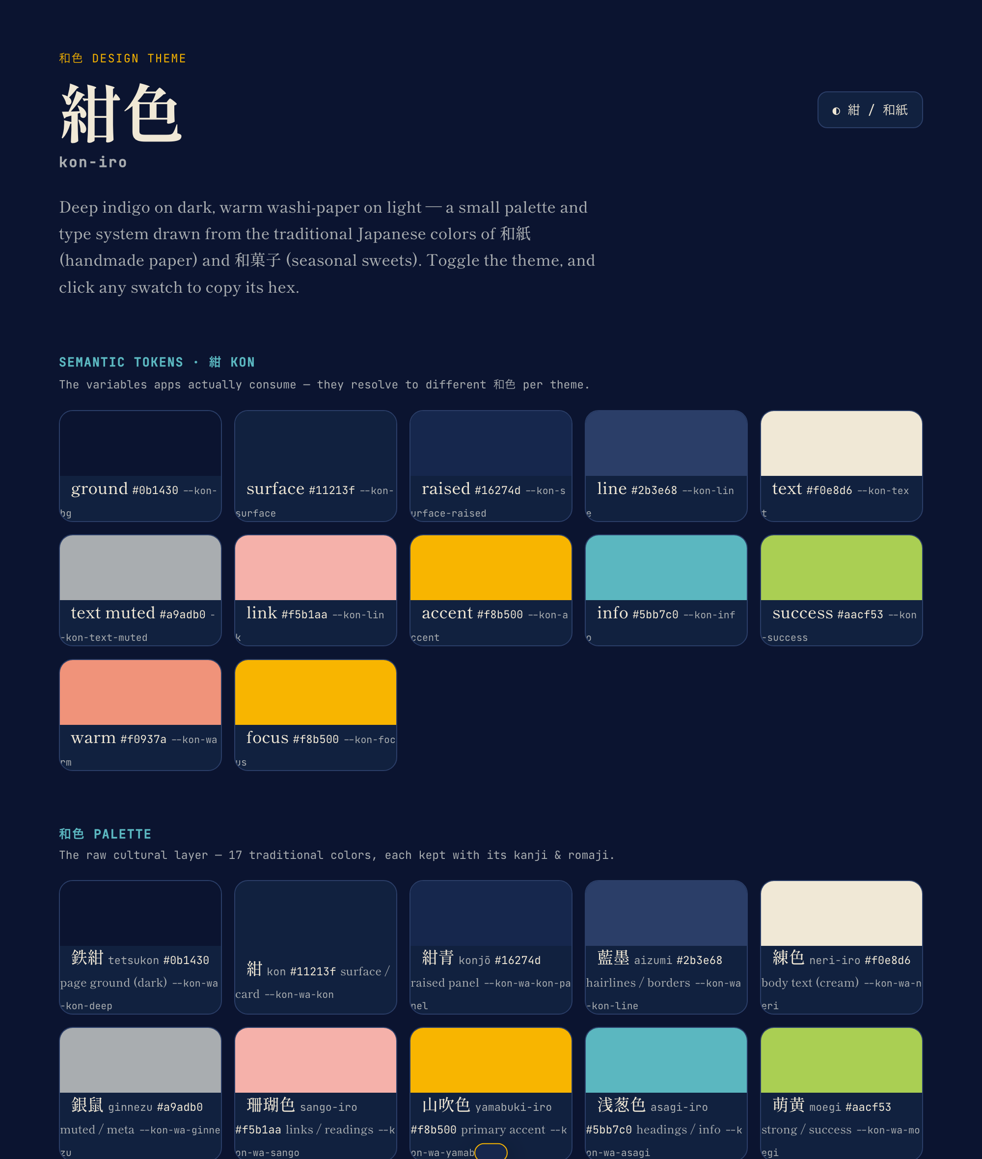
紺色 (kon-iro) is the deep indigo at the heart of this theme. The palette is drawn from the 和色 — the traditional Japanese colors found in 和紙 (washi, handmade paper) and 和菓子 (wagashi, the seasonal sweets) — each token keeping its kanji, romaji, and meaning.
Extracted from the 一日一語 / ichinichi-ichigo project and generalized into reusable design tokens.
Live palette: vbkmr.github.io/kon-iro — browse every 和色 in both themes and click any swatch to copy its hex.
紺 kon — dark (default) |
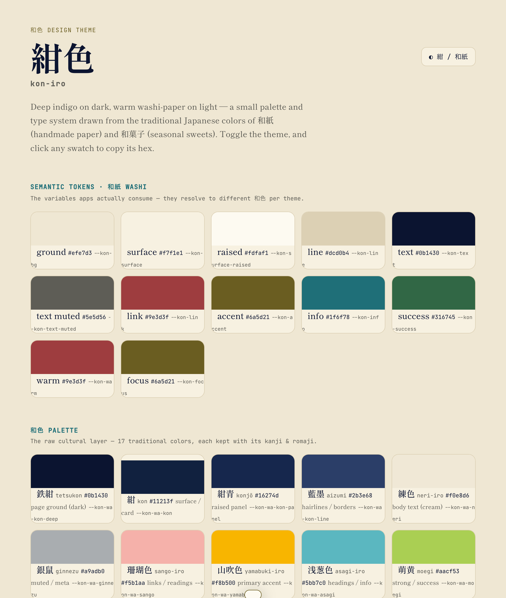
和紙 washi — light |
|---|---|
 |
 |
Two themes
| ground | text | accent | |
|---|---|---|---|
紺 kon (dark, default) |
鉄紺 #0b1430 |
練色 #f0e8d6 |
山吹色 #f8b500 |
和紙 washi (light) |
生成り #efe7d3 |
鉄紺 #0b1430 |
媚茶 #6a5d21 |
Dark 紺 is the default. Light 和紙 turns on with data-theme="washi" on <html>,
or automatically from the OS preference.
The 和色 palette
| 和色 | romaji | hex | role |
|---|---|---|---|
| 鉄紺 | tetsukon | #0b1430 |
page ground |
| 紺 | kon | #11213f |
surface / card |
| 紺青 | konjō | #16274d |
raised panel |
| 練色 | neri-iro | #f0e8d6 |
body text (washi cream) |
| 銀鼠 | ginnezu | #a9adb0 |
muted / meta |
| 珊瑚色 | sango-iro | #f5b1aa |
links / readings |
| 山吹色 | yamabuki-iro | #f8b500 |
primary accent |
| 浅葱色 | asagi-iro | #5bb7c0 |
headings / info |
| 萌黄 | moegi | #aacf53 |
strong / success |
| 退紅 | taikō | #f0937a |
warm accent |
Light-theme accents are deepened cousins of the same hues (媚茶 / 納戸色 / 千歳緑 / 蘇芳), all meeting WCAG AA on paper so text stays legible.
Type
- 明朝 — Shippori Mincho (serif): display + Japanese
- ゴシック — Zen Kaku Gothic New (sans): UI text
- JetBrains Mono: labels, meta, readings
Fonts are referenced, not bundled. Shippori Mincho & Zen Kaku Gothic New are OFL; JetBrains Mono is Apache-2.0.
Install
npm install kon-iro…or use the CSS directly with no build step.
1. Plain CSS (works anywhere)
<link rel="stylesheet" href="node_modules/kon-iro/dist/kon-iro.css" />
<!-- or vendor dist/kon-iro.css straight into a static site -->
body {
background: var(--kon-bg);
color: var(--kon-text);
font-family: var(--kon-font-jp);
}
a { color: var(--kon-link); }
.accent { color: var(--kon-accent); }Switch themes:
<html data-theme="washi"> ... </html>   <!-- light -->
<html data-theme="kon">   ... </html>   <!-- dark (default) -->
<!-- omit data-theme to follow the OS preference -->
2. Tailwind preset
// tailwind.config.js
module.exports = { presets: [require("kon-iro/tailwind")] };<div class="bg-kon-surface text-kon-text font-jp rounded-kon">
<span class="text-kon-accent">山吹</span>
</div>Import kon-iro/css once so the variables (and theme switching) exist.
3. JS / TS tokens
import { color, palette } from "kon-iro";
color.kon.accent;        // "#f8b500"
palette.kon.kanji;       // "紺"
How it's built
tokens/        ← source of truth (W3C DTCG JSON)
  palette.json     · 和色 raw colors + kanji/romaji metadata
  semantic.dark    · 紺  theme: bg / surface / text / accent … → palette
  semantic.light   · 和紙 theme
  base.json        · type, space, radius, motion
scripts/build.mjs ← dependency-free generator (tokens → dist)
dist/          ← GENERATED, what npm publishes (do not hand-edit)
  kon-iro.css      · CSS variables, both themes, zero-build
  kon-iro.ts       · typed token object
  tailwind-preset  · utility mapping → the CSS vars (hand-maintained)
docs/index.html ← live palette showcase (published to GitHub Pages)
The showcase reads its hex values from dist/kon-iro.css at runtime, so the
live site always mirrors the published colors.
A GitHub Actions workflow (.github/workflows/pages.yml) assembles docs/index.html
together with dist/ and deploys it on every push to main.
Two tiers on purpose: the palette tier carries the cultural identity (and can
be re-tuned), the semantic tier (--kon-bg, --kon-accent, …) is what apps
consume — so the look can evolve without breaking anything downstream.
tokens/ is the single source of truth. npm run build runs
scripts/build.mjs (Node built-ins only — no dependencies) to regenerate
dist/kon-iro.css and dist/kon-iro.ts. The DTCG token files stay portable, so
they can also feed Style Dictionary or native targets (SwiftUI / Compose /
React Native) later.
Roadmap
- Generate
dist/fromtokens/(dependency-freescripts/build.mjs) - WCAG AA contrast audit for every text/accent-on-ground pairing
- Native token outputs (SwiftUI, Compose, React Native)
- Optional headless components
- Publish
0.1.0to npm
License
MIT. The 和色 names and hex values are traditional and free to use.