DateFlow


Modern TypeScript date picker for web applications.
| ✓ | Single dates and ranges | ✓ | Time selection | ✓ | Framework agnostic | ||
| ✓ | Accessible | ✓ | Tree-shakeable locales | ✓ | Mobile friendly |
Live documentation & examples →
Install
npm install dateflow date-fnsdate-fns is a peer dependency — install it in your app.
Why DateFlow?
DateFlow was built for modern TypeScript applications.
- No framework lock-in
- Strong TypeScript support
- Accessible keyboard navigation
- Range selection built in
- Tree-shakeable locales
- ~20 kB gzip JavaScript
- ~3.4 kB gzip CSS
Quick start
<input id="trip" type="text" placeholder="Pick a date" />import { dateFlow } from "dateflow";
import "dateflow/style.css";
const input = document.querySelector<HTMLInputElement>("#trip")!;
const picker = dateFlow(input, {
value: new Date(),
popover: true, // default — opens below the input
});
// picker.destroy() when removing the field from the DOMdateFlow also accepts a #id selector or a .class selector (class returns one instance per matched input).
Features
- Single-date and range selection
- Optional time pickers (12h/24h, seconds, minute steps)
- Floating popover or inline layout
- Built-in locales (
en,de,cs,fr) with partial overrides - Min/max bounds, allowlists, blocklists, week numbers
- Typed programmatic API (
setDate,setRange,open,close, …) - Accessible markup and keyboard support
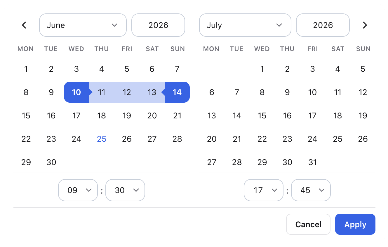
Date ranges
dateFlow(input, {
  mode: "range",
  range: { start: new Date(2026, 5, 1), end: new Date(2026, 5, 14) },
  onRangeChange: (range) => console.log(range),
});
Range mode shows Apply / Cancel actions. Use onRangeChange for committed range updates.
Locales
Locales are a separate entry so you only bundle what you import:
import { dateFlow } from "dateflow";
import { de } from "dateflow/locales";
import "dateflow/style.css";

dateFlow(input, { locale: de });
Built-in locales: en, de, cs, fr. Pass a partial CalendarLocale object to override individual strings.
Options
| Option | Description |
|---|---|
mode |
"single" (default) or "range" |
value |
Selected Date in single mode |
range |
{ start, end } in range mode |
onChange / onRangeChange |
Called when the value is committed |
minDate / maxDate |
Selectable bounds |
disabledDates / enabledDatesOnly |
Block or allow specific dates (array or predicate) |
disabledDatesStrikeThrough |
Strike through disabled day numbers |
showTime |
Enable hour/minute (and optional second) selectors |
use12HourTime |
12-hour clock with AM/PM when showTime is on |
showSeconds |
Show seconds selector |
minuteStep |
Minute dropdown step (default 5) |
outputFormat |
date-fns format pattern for the visible value |
rangeOutputSeparator |
Between start and end in range output (default "—") |
showWeekNumbers |
ISO week numbers in the first column |
allowInput |
Type dates directly into the value field |
hideOnSingleSelect |
Close popover after picking a day in single mode (default true) |
inline |
Render calendar in-page instead of a popover |
popover |
Open on focus, position with Floating UI, close on outside click / Escape (default true) |
appendTo |
Popover mount target (default document.body) |
className / theme |
Extra class / data-cal-theme on the calendar root |
showResetButton / resetInputLabel |
Header reset control |
ariaLabel |
Accessible name for the calendar region |
locale |
Locale from dateflow/locales or a custom partial object |
See the documentation for full examples: constraints, time selection, theming, and more.
Instance API
Each call to dateFlow returns a CalendarPickerInstance:
| Method / property | Description |
|---|---|
selectedDates / currentYear |
Read-only view state |
getValue() / setValue(date) |
Single-mode value |
getRange() / setRange(range) |
Range-mode value |
setDate(dates, format?, silent?) |
Set one or more dates (strings use date-fns parsing) |
changeMonth(months, relative?) |
Navigate the visible month |
clear() |
Clear selection (same as reset) |
setOptions(partial) |
Merge options and re-render |
open() / close() |
Show or hide the panel |
getInputElement() / getCalendarElement() |
DOM references |
destroy() |
Tear down listeners and popover |
Browser support
DateFlow targets modern evergreen browsers. The library ships as ESM and uses current DOM APIs (replaceChildren, optional chaining, and similar).
| Browser | Minimum version |
|---|---|
| Chrome / Edge | 111+ |
| Firefox | 113+ |
| Safari / iOS | 16.2+ |
These versions cover full styling, including CSS color-mix() used for themes and range highlights. The picker may still work on slightly older browsers (for example Safari 14+), but colors and transparency can look incorrect.
Internet Explorer is not supported. Use a bundler (Vite, webpack, Rollup, etc.) in your app — DateFlow does not ship a legacy UMD build.
Development
pnpm install
pnpm dev            # docs showcase (local)
pnpm build          # library → dist/
pnpm build:docs     # static docs site → dist-docs/
pnpm test           # unit tests
pnpm lint           # oxlint + type-aware checks
pnpm check          # format, lint, and types
CI runs lint, tests, and build on every push. Docs deploy to GitHub Pages on push to main.
License
MIT