Bottom Sheet Stepper
A lightweight and customizable step-based component for React Native, built on top of @gorhom/bottom-sheet. Perfect for building multi-step flows like wizards, onboarding screens, or custom forms — all in a sleek bottom sheet.


Features
- Multi-step navigation with
onNextPress,onBackPress, and optionalonEnd - Smooth animations with
react-native-reanimated - Fully customizable styles and layout
- Built-in height animation & cleanup handling
- Programmatic control with
present()anddismiss()
Installation
npm install bottom-sheet-stepper
# or
yarn add bottom-sheet-stepper
Peer Dependencies
Make sure you have the following installed in your project:
npm install react-native-reanimated react-native-gesture-handler @gorhom/bottom-sheetThen wrap your app with the necessary providers:
import { GestureHandlerRootView } from "react-native-gesture-handler";
import { BottomSheetModalProvider } from "@gorhom/bottom-sheet";

<GestureHandlerRootView style={{ flex: 1 }}>
  <BottomSheetModalProvider>
    <App />
  </BottomSheetModalProvider>
</GestureHandlerRootView>;
Usage
import React, { useRef } from "react";
import BottomSheetStepper, {
BottomSheetStepperRef,
StepComponentProps,
} from "bottom-sheet-stepper";
const Step1 = ({ onNextPress }: StepComponentProps) => (
<View>
<Text>Step 1</Text>
<Button title="Next" onPress={onNextPress} />
</View>
);
const Step2 = ({ onBackPress, onEnd }: StepComponentProps) => (
<View>
<Text>Step 2</Text>
<Button title="Back" onPress={onBackPress} />
<Button title="Finish" onPress={onEnd} />
</View>
);
const App = () => {
const stepperRef = useRef<BottomSheetStepperRef>(null);
return (
<>
<Button
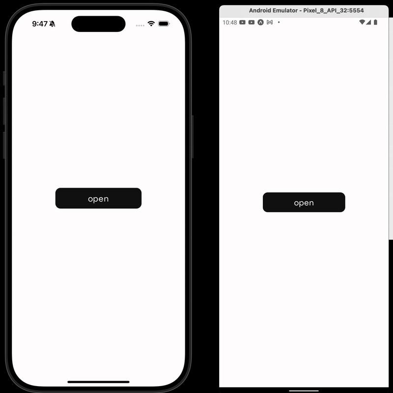
title="Open Stepper"
onPress={() => stepperRef.current?.present()}
/>
<BottomSheetStepper ref={stepperRef} steps={[Step1, Step2]} />
</>
);
};API Reference
Props
| Name | Type | Description |
|---|---|---|
steps |
((props: StepComponentProps) => React.ReactNode)[] |
Array of step render functions |
style |
StyleProp<ViewStyle> |
Optional style applied to step container |
bottomInset |
number |
Padding at bottom of the sheet (default: 20) |
horizontalInset |
number |
Horizontal margin of the sheet (default: 24) |
disablePanDownToClose |
boolean |
Disabling the pan to close gesture |
disableBackDropPressToClose |
boolean |
Disabling the background press closing the modal |
Step Props (StepComponentProps)
Passed to each step component:
type StepComponentProps = {
  onNextPress: () => void;
  onBackPress: () => void;
  onEnd?: () => void;
};
Imperative API
You can control the sheet externally via ref:
const ref = useRef<BottomSheetStepperRef>(null);

ref.current?.present();
ref.current?.dismiss();
Example Use Cases
- Onboarding flows
- Step-by-step data collection
- Multi-step modals
- Form wizards
Built With
License
Made with by @mahdidavoodi7