@t007/dialog
A lightweight, promise-based vanilla JavaScript dialog system providing modern, accessible replacements for native
alert,confirm, andpromptwindows.

Table of contents
Overview
@t007/dialog is a lightweight UI library that completely overrides the "ugly", thread-blocking native browser dialogs with beautiful, non-blocking, Promise-based alternatives.
Why @t007/dialog?
- Non-Blocking Promises: Awaits user input asynchronously without freezing the main thread.
- Native Accessibility: Built on top of the modern HTML5
<dialog>element. - Smart Loading: The
promptdialog dynamically lazy-loads the@t007/inputdependency only when needed. - Zero Frameworks: Pure vanilla JS, meaning it works flawlessly in React, Vue, Angular, or raw HTML.
- Global Injection: Automatically attaches to
window.Alert,window.Confirm, andwindow.Promptfor drop-in legacy code replacement.
Demo & Screenshots
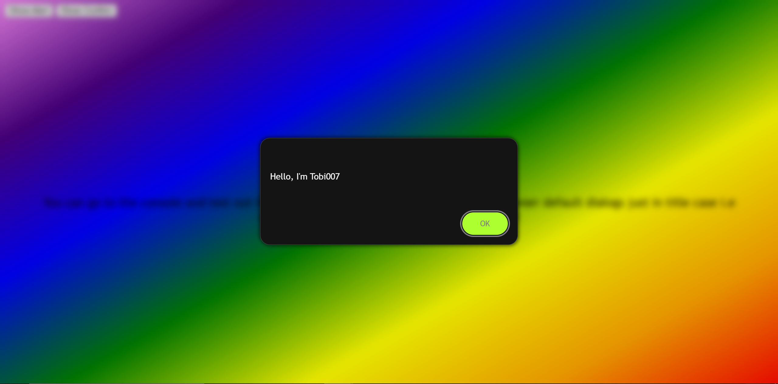
Alert Dialog
A clean, single-action notification window.
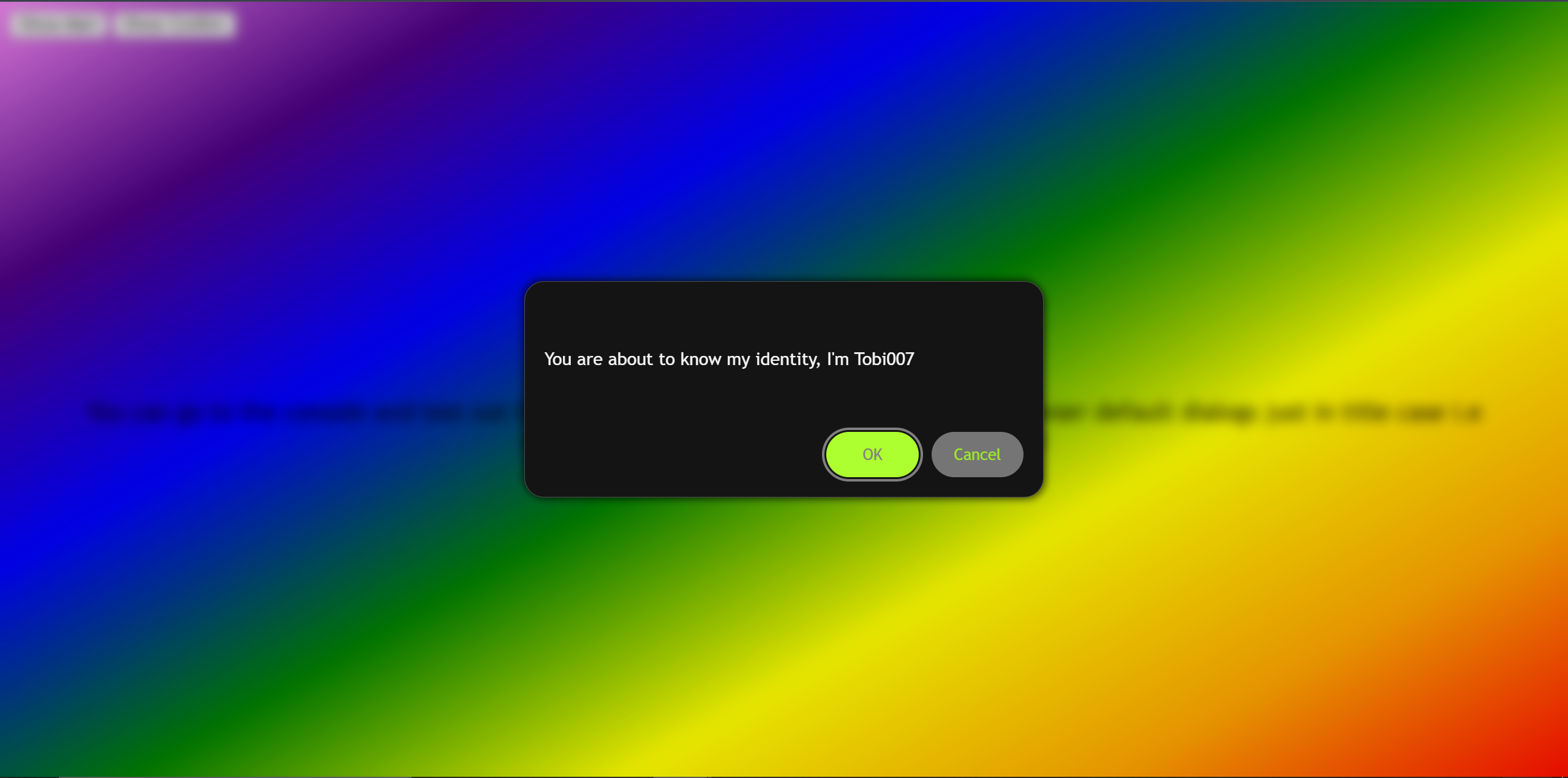
Confirm Dialog
A dual-action window returning a strict boolean based on user choice.
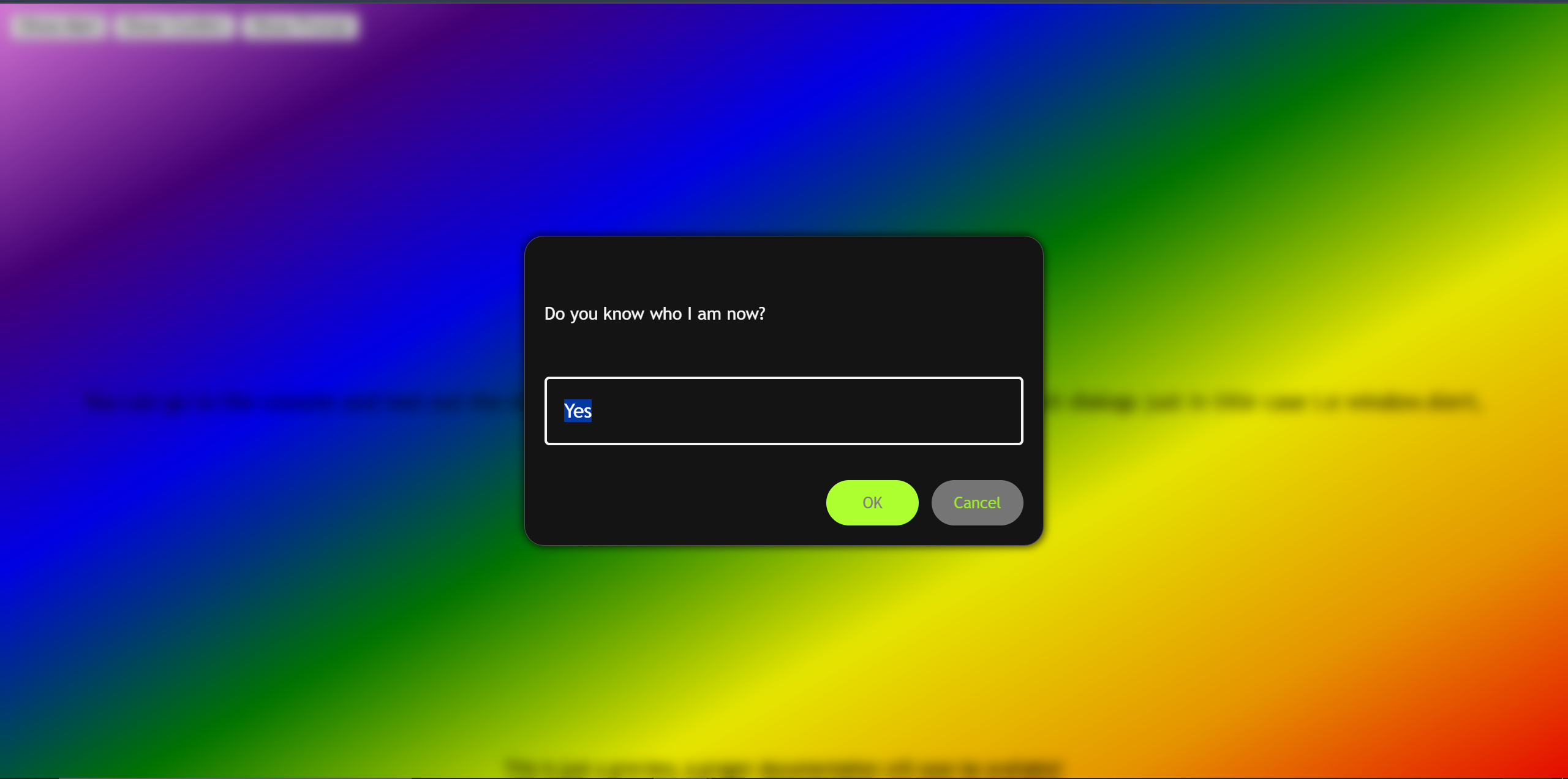
Prompt Dialog
Integrates with the t007.FM (Form Manager) to capture, validate, and return user input.
Features
- Promise-Based API: Use
async/awaitfor incredibly clean control flow. - Form Validation: Native form validation built directly into the prompt modal.
- Keyboard Navigation: Native
Esckey cancellation and auto-focusing capabilities. - Highly Customizable: Clean DOM structure with distinct CSS classes for easy overriding.
Tech Stack
Built with
- Semantic HTML5
<dialog>API - CSS Custom Properties & Flexbox
- Vanilla JavaScript (ES6+)
- Bundled via
tsup(ESM, CJS, IIFE outputs)
Getting Started
Installation
Install via your preferred package manager:
npm install @t007/dialog
# or
yarn add @t007/dialog
# or
pnpm add @t007/dialog
Usage
Modern Bundlers (ESM)
If you are using Vite, Webpack, Next.js, or any modern build tool:
import '@t007/dialog/style.css';
import { alert, confirm, prompt } from '@t007/dialog'; // also attached to window.t007

// 1. Alert
async function triggerAlert() {
  await alert('Operation completed successfully!');
  console.log('User dismissed the alert.');
}

// 2. Confirm
async function triggerConfirm() {
  const isSure = await confirm('Are you sure you want to delete this file?');
  if (isSure) {
    console.log('Deleting...');
  } else {
    console.log('Action cancelled.');
  }
}

// 3. Prompt
async function triggerPrompt() {
  const username = await prompt('Enter your new username:', 'guest_user');
  if (username !== null) {
    console.log(`Username changed to: ${username}`);
  }
}
CDN / Browser (Global)
If you are not using a bundler, the IIFE build automatically injects the dialogs into the global t007 object and provides convenient capitalized window fallbacks (window.Alert, window.Confirm, window.Prompt), reassign if desired.
<!DOCTYPE html>
<html>
<head>
  <link rel="stylesheet" href="https://cdn.jsdelivr.net/npm/@t007/dialog@latest/dist/index.css">
</head>
<body>

  <script src="https://cdn.jsdelivr.net/npm/@t007/dialog@latest"></script>

  <script>
    // The library automatically maps to window.Confirm!
    document.getElementById('deleteBtn').addEventListener('click', async () => {
      const proceed = await Confirm("Proceed with formatting?"); // or use `t007.confirm()`, `t007.dialog` contains the whole API
      if(proceed) doFormat();
    });
  </script>
</body>
</html>
API Reference
alert(message, options)
Displays a simple message and a confirmation button.
message(String): The text to display.options(Object): Optional configuration.options.id(String): Unique identifier for the dialog for programmatic dismissal.options.confirmText(String): Custom text for the button (Default:"OK").options.closedBy(String): Browser behavior for handling dialog closure.options.rootElement(HTMLElement): Render dialog inside this element.options.scoped(Boolean): Whether to restrict interactions torootElementif provided. Defaults totrue.
- Returns:
Promise<true>
confirm(question, options)
Displays a question with confirm and cancel buttons.
question(String): The question to ask the user.options(Object): Optional configuration.options.id(String): Unique identifier for the dialog for programmatic dismissal.options.confirmText(String): Custom text for the confirm button (Default:"OK").options.cancelText(String): Custom text for the cancel button (Default:"Cancel").- Last 3 in
alert()apply here as well...
- Returns:
Promise<boolean>(trueif confirmed,falseif cancelled).
prompt(question, defaultValue, options)
Displays an input field to collect data from the user. Note: This automatically loads the @t007/input dependency if required.
question(String): The prompt instructions.defaultValue(String): The initial value placed inside the input.options(Object): Optional @t007/input configuration passed directly to the input field generation.options.id(String): Unique identifier for the dialog for programmatic dismissal, also used as the input's ID.options.confirmText(String): Custom text for the submit button.options.cancelText(String): Custom text for the cancel button.- Accepts standard HTML input attributes (type, required, placeholder, etc.)
- Last 3 in
alert()apply here as well...
- Returns:
Promise<String | null>(Returns the string value, ornullif cancelled).
dismiss(id, response)
Programatically dismiss a dialog by id or all dialogs when no id is provided.
id(String): Optional unique identifier of the dialog to dismiss. If not provided, all dialogs will be dismissed.response(Any): Optional value to resolve the dialog's promise with. If not provided, defaults totruefor confirm and alert dialogs, andnullfor prompt dialogs.
isActive(id)
Check if a dialog is currently active. Optionally check for a specific dialog by id.
id(String): Optional unique identifier of the dialog to check. If not provided, checks if any dialog is active.- Returns:
boolean(trueif the specified dialog or any dialog is active, otherwisefalse).
Backdrop behavior
- Default mode uses native
<dialog>.showModal()and native::backdrop. - Scoped mode (
rootElement) uses<dialog>.show()with a pseudo backdrop.
NOTE: Scoped mode only restricts interactions within the specified root and top layer, while default mode is truly modal and blocks all interactions until dismissed. Choose based on your application's needs, you might need to gate some business logic depending on the mode.
Customization
The dialogs are built with semantic, easily targetable CSS classes. You can easily override these in your own stylesheet to match your application's theme.
CSS Selectors & Variables
.t007-dialog: The main<dialog>container..t007-dialog-top-section: The wrapper for the text content..t007-dialog-question: The actual message/question text..t007-dialog-bottom-section: The wrapper for the action buttons..t007-dialog-confirm-button: The primary action button..t007-dialog-cancel-button: The secondary/cancel button..t007-input-form: The form wrapper used exclusively in thepromptdialog.
Override Starter (Chrome like)
:root {
  --app-theme-color: white;
  --app-brand-color: red;
  --app-brand-accent-color: orangered;
  --t007-dialog-backdrop-background: rgba(0, 0, 0, 0.6);
  --t007-dialog-backdrop-filter: none;
  --t007-cancel-button-color: dodgerblue;
  /* ...check source code for all variables... */
}
.t007-dialog {
  margin-top: 0;
  /* advised override variables */
  --t007-dialog-unit: 0.9rem;
  --t007-dialog-message-color: var(--app-theme-color);
  --t007-dialog-confirm-button-color: var(--app-brand-accent-color);
  --t007-dialog-cancel-button-color: var(--app-brand-color);
}
Specificity Note
- Start with
:rootfor shared dialog tokens. - If a token does not apply, override directly on
.t007-dialog. - For sizing/layout variables, override
.t007-dialog(unit, width, icon size, margins). - For strong app themes (e.g.
html[data-theme="dark"]), use equal/stronger selectors likehtml[data-theme="dark"] .t007-dialog. - Check source code for more details.
Author
- Developer - Oketade Oluwatobiloba (Tobi007-del)
- Project - t007-tools
Acknowledgments
Built to support modern web applications requiring non-blocking, highly customizable UI interfaces. Part of the @t007 utility ecosystem.
Star History
If you find this project useful, please consider giving it a star!