cards-css

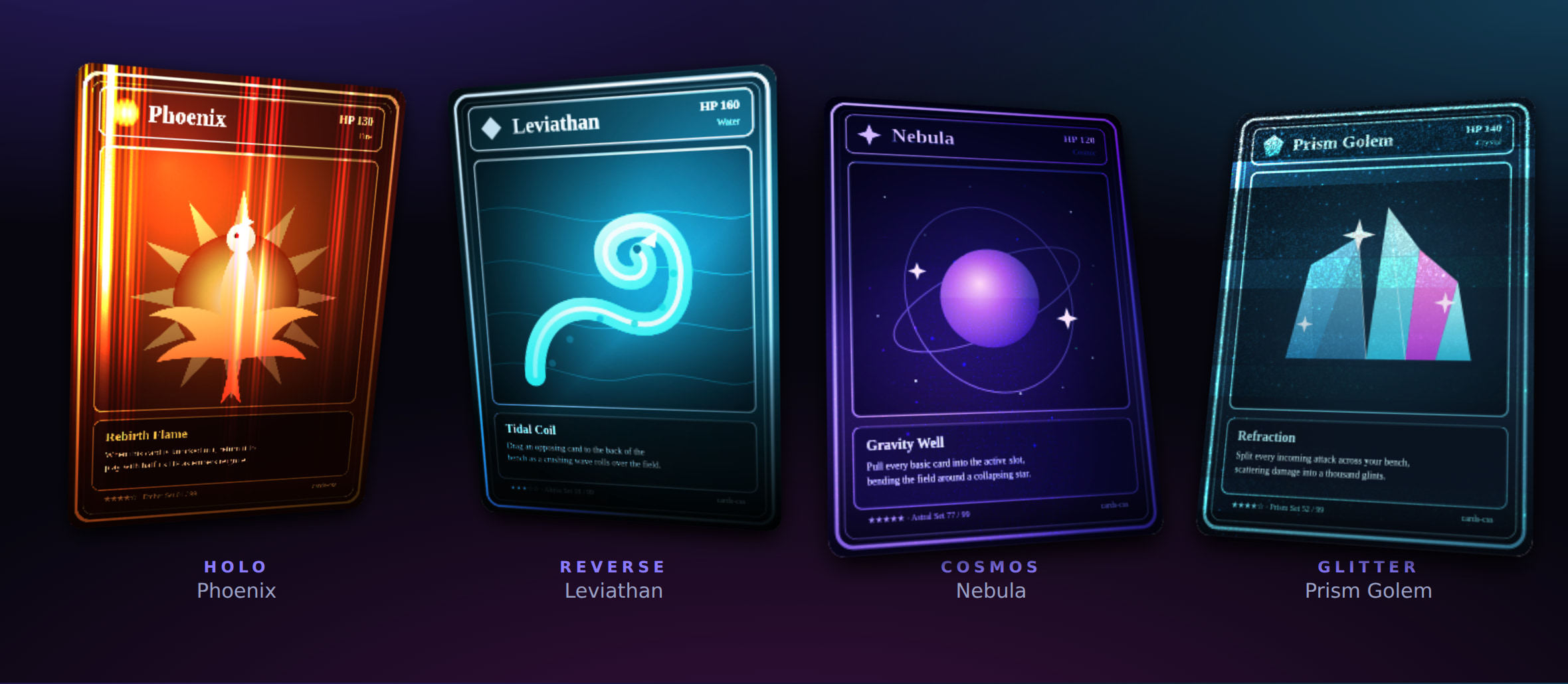
Framework-agnostic holographic trading-card effect — tilt, shine, glare and four
foils (holo / reverse / cosmos / glitter) that react to pointer and
gyroscope, with procedurally code-generated textures. No runtime dependencies.
Live demo → — move the pointer across a card, or tilt your phone, to see the foil shift.
Install
npm install @kongyo2/cards-cssQuick start
import { createHoloCard } from "@kongyo2/cards-css";
import "@kongyo2/cards-css/styles.css";

const card = createHoloCard({
  image: "/cards/phoenix.png",
  imageAlt: "Phoenix",
  effect: "holo",
});

document.querySelector("#stage").append(card.element);
createHoloCard builds the full element for you. To enhance markup you already
have on the page (it must contain the .holo-card__rotator structure), use
attachHoloCard(element, options) instead.
Effects
Set via the effect option (or card.setEffect(...) at runtime):
| Effect | Description |
|---|---|
none |
Tilt, shine and glare only — no foil |
holo |
Rainbow holographic foil |
reverse |
Reverse-line holographic foil |
cosmos |
Galaxy / cosmos foil (procedural — needs textureSeed) |
glitter |
Glitter / sparkle foil (procedural — needs textureSeed) |
Options
| Option | Type | Default | Notes |
|---|---|---|---|
image |
string |
— | Front image source (required for createHoloCard) |
imageAlt |
string |
"" |
Alt text for the front image |
back / backAlt |
string |
— | Optional card-back image and its alt text |
className |
string |
— | Extra class names for the root element |
effect |
HoloEffect |
"none" |
One of the effects above |
interactive |
boolean |
true |
React to pointer move |
activateOnClick |
boolean |
false |
Click to pop the card into a centered showcase |
gyroscope |
boolean | GyroscopeOptions |
true |
Tilt to device orientation while active; pass an object to tune rangeX / rangeY / sensitivity / invertX / invertY |
showcase |
boolean | ShowcaseOptions |
false |
Auto-animate once on mount; pass an object to tune delay / duration / loop / speed / intensity / spring |
glow |
string |
— | CSS color for the card glow |
aspectRatio |
number |
— | Card aspect ratio (width / height) |
textureSeed |
number |
— | Seed for the generated cosmos / glitter textures; without it those two foils render without their procedural layers |
mask |
string | MaskOptions |
— | Mask URL, or { image, size, position, repeat, mode } — mode: "card" clips the whole card into the mask silhouette |
foil |
string |
— | URL for a custom foil overlay |
palette |
PaletteOptions |
— | Foil colour theming: a preset (rainbow / gold / aurora / ruby / sapphire / mono) and/or custom sunpillars / spectrum / cosmos colour stops plus edge / back / glow |
glare |
GlareOptions |
— | Custom dynamic glare: a full image, or compose the pointer-tracking gradient from shape / extent / size / stops, plus blend / opacity |
depth |
boolean | DepthOptions |
— | Foil 3D depth / extrusion: true for defaults, or tune strength / perspective / shadow / layerScale |
physics |
PhysicsOptions |
— | Interaction tuning: maxTilt / maxTiltX / maxTiltY, parallax, glareRange, returnDelay, and per-target spring tuning (interactSpring / popoverSpring / snapSpring / springs) |
visual |
VisualOptions |
— | Foil multipliers (brightness / contrast / saturate / glareOpacity / shineOpacity) and lineSpace / lineAngle / glitterSize / imageFit |
layers |
HoloLayerOptions[] |
— | Extra stacked layers between artwork and foil, each with image / content, blend, opacity, parallax, mask |
vars |
Record<string, string | number> |
— | Arbitrary CSS custom properties on the root, for content linkage |
createHoloCard additionally accepts content and overlay (a Node or
(doc) => Node) for free-form front and foreground content — name plates,
badges, live data — plus overlayInteractive to let the overlay receive
pointer events.
Asymmetric springs
Every spring tuning accepts an axes map for independent per-component physics,
so a card can snap horizontally while easing vertically:
createHoloCard({
  image: "/cards/phoenix.png",
  effect: "holo",
  physics: { springs: { rotate: { axes: { x: { stiffness: 0.12 }, y: { stiffness: 0.04 } } } } },
});
Content linkage
While interacting, the card publishes its state as CSS custom properties on the
root — --pointer-x, --pointer-y, --pointer-dx / --pointer-dy (signed,
−1…1), --tilt-x / --tilt-y (degrees), --pointer-from-center and
--card-active — so custom content / overlay / layers can parallax, glow
or react in lockstep with the foil.
API
createHoloCard(options)→HoloCard— builds the element (imagerequired).attachHoloCard(element, options?)→HoloCard— wraps existing markup.HoloCardelement— the rootHTMLElementto mount.active/interacting— state getters.front— the.holo-card__frontelement (ornull), for appending content.activate()/deactivate()— pop the card in / out of showcase.setEffect(effect)— swap the foil at runtime.setVisual(visual)/setVars(vars)— update visual controls / CSS variables at runtime.setPalette(palette)— recolour the foil / swap themes at runtime.setGlare(glare)— update the dynamic glare at runtime.setDepth(depth)— toggle or tune the 3D depth at runtime (falsedisables it).setGyroscope(gyroscope)— update gyroscope tuning at runtime.addLayer(options)— insert an extra layer between artwork and foil, returns the element.destroy()— remove listeners and reset the element.
On iOS, gyroscope access needs a one-time permission prompt triggered by a user
gesture — call requestOrientationPermission() (exported) from a click/tap
handler.
License
MIT kongyo2