Mantine Split Pane Component

Overview
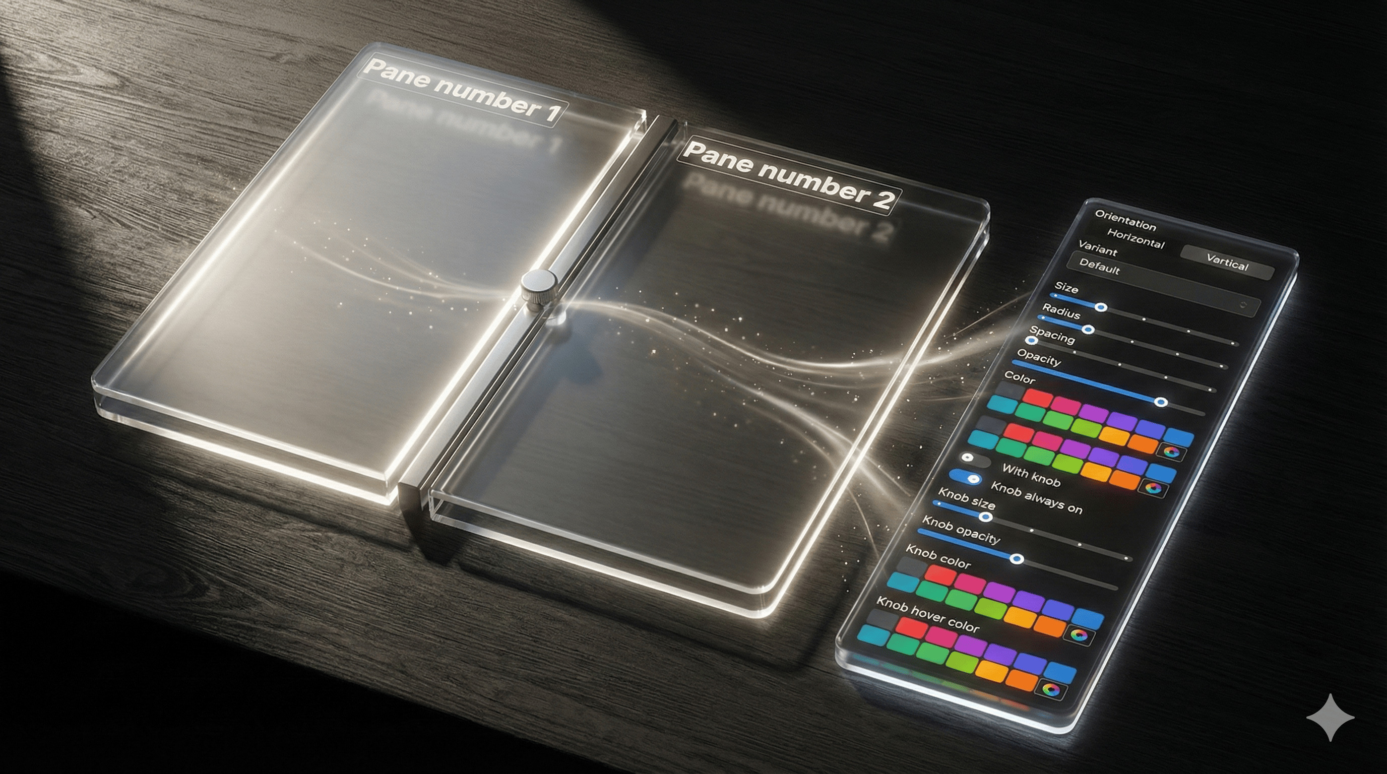
A Mantine 9 React component for resizable split pane layouts with 7 resizer variants, context-based prop inheritance, responsive orientation, and dynamic pane generation.
This component is created on top of the Mantine library. It requires Mantine 9.x and React 19.
→ Demo and Documentation → Youtube Video → More Mantine Components
Features
- Separate
Split.Pane(content) andSplit.Resizer(drag handle) architecture - 7 resizer variants:
default,filled,outline,transparent,gradient,dotted,dashed - Initial sizes in pixels or percentages with min/max constraints
growproperty to let specific panes expand to fill available space- Horizontal and vertical orientation, including responsive breakpoints
- Context-based prop inheritance: resizer props set on
Splitcascade to all children - Per-resizer overrides for full control
- Snap points for common pane sizes during drag and keyboard resizing
autoResizersmode to automatically insert resizers between panesSplit.Dynamichelper to generate panes from a configuration array- Resize lifecycle events (
onResizeStart,onResizing,onResizeEnd) on both pane and resizer — fired on drag, keyboard resize, and double-click reset - Custom content inside
Split.Resizerfor drag-affordance icons, labels, or fully bespoke handles - Keyboard accessible: focusable resizer with configurable
stepandshiftStep - Container resize tracking with drag ratio preservation
Split vs Mantine core Splitter
Since v9.3, Mantine core ships its own Splitter component. The basics overlap, but the two make different trade-offs:
- Fully customizable resizer —
Split.Resizeris a standalone component with 7 variants, gradients, hover states, knob, custom cursors and custom content; core's Splitter renders a separator line with a grip icon - Snap points — panes snap to predefined sizes while dragging or resizing with the keyboard (
snapPoints,onSnap); not available in core - CSS-unit sizing — pane sizes and constraints accept px, %, rem (
initialWidth,minWidth, ...), while core works with percentages that must sum to 100 - Responsive everything — orientation, pane sizes, min/max and snap points accept Mantine breakpoint maps; core's orientation and sizes are plain values
- Config-driven layouts —
Split.Dynamicgenerates panes and resizers from aPaneConfig[]array
Core's Splitter shines for simple proportional layouts and ships collapsible panes plus the headless use-splitter hook. See the full comparison in the documentation.
Installation
npm install @gfazioli/mantine-split-paneor
yarn add @gfazioli/mantine-split-paneAfter installation import package styles at the root of your application:
import '@gfazioli/mantine-split-pane/styles.css';Usage
import { Split } from '@gfazioli/mantine-split-pane';
import { Paper } from '@mantine/core';

function Demo() {
  return (
    <Split>
      <Split.Pane>
        <Paper withBorder w="100%" mih="100%">
          <h1>Pane 1</h1>
        </Paper>
      </Split.Pane>

      <Split.Resizer />

      <Split.Pane>
        <Paper withBorder>
          <h1>Pane 2</h1>
        </Paper>
      </Split.Pane>
    </Split>
  );
}
Auto Resizers
Use the autoResizers prop to automatically insert resizers between panes:
import { Split } from '@gfazioli/mantine-split-pane';
import { Paper } from '@mantine/core';

function Demo() {
  return (
    <Split autoResizers>
      <Split.Pane>
        <Paper withBorder w="100%" mih="100%">
          <h1>Pane 1</h1>
        </Paper>
      </Split.Pane>

      <Split.Pane>
        <Paper withBorder>
          <h1>Pane 2</h1>
        </Paper>
      </Split.Pane>

      <Split.Pane>
        <Paper withBorder>
          <h1>Pane 3</h1>
        </Paper>
      </Split.Pane>
    </Split>
  );
}
Snap Points
Use snapPoints and snapTolerance to snap a resizer to common pane sizes in pixels while dragging or using the keyboard:
import { Split } from '@gfazioli/mantine-split-pane';
import { Paper } from '@mantine/core';

function Demo() {
  return (
    <Split autoResizers snapPoints={[200, 400, 600]} snapTolerance={20}>
      <Split.Pane initialWidth={240}>
        <Paper withBorder w="100%" mih="100%">
          <h1>Pane 1</h1>
        </Paper>
      </Split.Pane>

      <Split.Pane initialWidth={320}>
        <Paper withBorder w="100%" mih="100%">
          <h1>Pane 2</h1>
        </Paper>
      </Split.Pane>

      <Split.Pane grow>
        <Paper withBorder w="100%" mih="100%">
          <h1>Pane 3</h1>
        </Paper>
      </Split.Pane>
    </Split>
  );
}
snapPoints and snapTolerance are also available on Split.Resizer for per-divider overrides. With autoResizers, the generated resizers inherit these values from Split.
Dynamic Panes
You can also use Split.Dynamic to create panes from a configuration array:
import { Split, PaneConfig } from '@gfazioli/mantine-split-pane';
import { Paper } from '@mantine/core';

function Demo() {
  const panes: PaneConfig[] = [
    {
      id: 'sidebar',
      initialWidth: 200,
      minWidth: 150,
      content: (
        <Paper withBorder w="100%" h="100%">
          <h1>Sidebar</h1>
        </Paper>
      ),
    },
    {
      id: 'main',
      grow: true,
      content: (
        <Paper withBorder w="100%" h="100%">
          <h1>Main Content</h1>
        </Paper>
      ),
    },
  ];

  return (
    <Split>
      {Split.Dynamic({ panes })}
    </Split>
  );
}
Sponsor
Your support helps me:
- Keep the project actively maintained with timely bug fixes and security updates
- Add new features, improve performance, and refine the developer experience
- Expand test coverage and documentation for smoother adoption
- Ensure long-term sustainability without relying on ad hoc free time
- Prioritize community requests and roadmap items that matter most
Open source thrives when those who benefit can give back—even a small monthly contribution makes a real difference. Sponsorships help cover maintenance time, infrastructure, and the countless invisible tasks that keep a project healthy.
Your help truly matters.
Become a sponsor today and help me keep this project reliable, up-to-date, and growing for everyone.
https://github.com/user-attachments/assets/2e45af2b-60c7-4cb3-9b9a-6cf0e710af1c