@2security/lunar-date-picker

A powerful and feature-rich React Native lunar date picker component built with Nitro Modules, providing native performance for both iOS and Android platforms.
Preview
| iOS Preview | Android Preview |
|---|---|
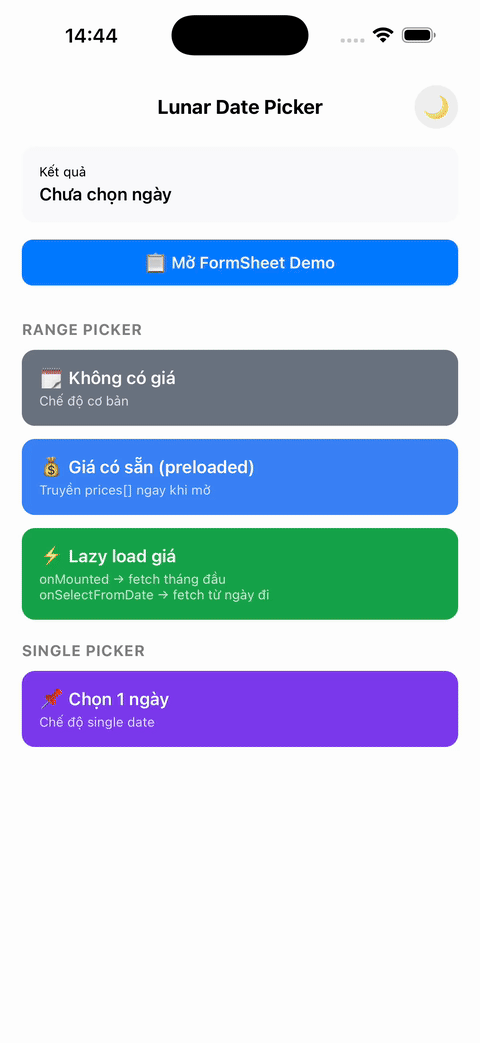 |
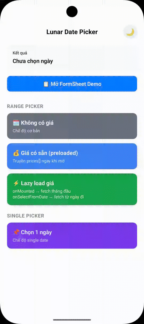 |
Features
- Lunar calendar support - Display both solar and lunar dates with proper timezone handling
- Cross-platform - Works seamlessly on iOS and Android with identical behavior
- High performance - Built with Nitro Modules for native performance
- Optimized Android rendering - Uses high-performance kizitonwose Calendar library for 60% faster scrolling
- Fluid layout scaling - Automatically scales typography and UI elements for a consistent look across all phone sizes (390px to 430px)
- Native tablet support - Beautiful centered Form Sheet presentation on iPads and Android tablets
- Customizable themes - Light/dark themes with full customization
- Multi-language support - Vietnamese, English, and extensible for other languages
- Flexible date selection - Single date or date range selection
- Timezone aware - Proper timezone support for accurate date handling across regions
- Optimized rendering - Hash-based change detection and partial updates for better performance
Note: This calendar is designed specifically for flight booking and scheduling use cases. As such, it is intentionally not an "infinite" calendar. It only renders a limited number of years (configurable via
yearRangeOffset) to optimize performance and memory usage for booking scenarios.
Installation
npm install @2security/lunar-date-picker react-native-nitro-modules
# or
yarn add @2security/lunar-date-picker react-native-nitro-modules
Note:
react-native-nitro-modulesis required as this library relies on Nitro Modules for native performance.
Expo Usage
This library uses native code and cannot be used with Expo Go. You must use Development Builds.
1. Installation
npx expo install @2security/lunar-date-picker react-native-nitro-modules2. Run with Development Build
npx expo run:ios
# or
npx expo run:android
Quick Start
1. Configure the picker (Required)
import { configure } from '@2security/lunar-date-picker';

const pickerConfig = {
  languages: {
    vi: {
      weekdayNames: ['T2', 'T3', 'T4', 'T5', 'T6', 'T7', 'CN'],
      locale: 'vi-VN',
    },
    en: {
      weekdayNames: ['Mon', 'Tue', 'Wed', 'Thu', 'Fri', 'Sat', 'Sun'],
      locale: 'en-US',
    },
  },
  themes: {
    light: {
      backgroundColor: '#ffffff',
      titleColor: '#000000',
      dateLabelColor: '#030712',
      todayLabelColor: '#3B82F6',
      lunarDateLabelColor: '#6B7280',
      selectedTextColor: '#FFFFFF',
      weekendLabelColor: '#E27B00',
      specialDayLabelColor: '#ff3300',
      monthLabelColor: '#030712',
      secondColor: '#3B82F6',
      weekViewBackgroundColor: '#F3F4F6',
      selectedBackgroundColor: '#3B82F6',
      rangeBackgroundColor: '#EFF6FF',
      submitButtonColor: '#3B82F6',
      noticeLabelColor: '#004085',
      noticeBackgroundColor: '#cce5ff',
    },
  },
  yearRangeOffset: 2,
  timeZoneOffset: 7, // GMT+7 for Vietnam
  showSubmitButton: true,
};

// Configure once in your app initialization
configure(pickerConfig);
2. Basic usage
import { pickDate } from '@2security/lunar-date-picker';

const openDatePicker = () => {
  pickDate({
    theme: 'light',
    language: 'vi',
    title: 'Chọn ngày',
    mode: 'range', // or 'single'
    minimumDate: '01/01/2024', // Optional: minimum selectable date (DD/MM/YYYY)
    maximumDate: '31/12/2024', // Optional: maximum selectable date (DD/MM/YYYY)
    notice: 'Lưu ý: Giá vé có thể thay đổi tùy thời điểm.', // Optional banner text
    onMounted: (start, end) => {
      console.log('Calendar visible range:', start, 'to', end);
    },
    onSelectFromDate: (start, end) => {
      console.log('Selected from-date. New range:', start, 'to', end);
    },
    onDone: (result) => {
      console.log('Selected range:', result);
      // result: LDP_Range = { from: "15/01/2024", to?: "20/01/2024" }
    },
  });
};
API Reference
Functions
configure(config: LDP_ConfigParams): void
Configure the picker with themes, languages, and global settings. Must be called before using the picker.
pickDate(params: LDP_PresentParams): void
Display the date picker with specified configuration.
updatePrices(params: LDP_PriceUpdateParams): void
Update the prices displayed on the calendar. This can be called while the picker is open to update the UI immediately (e.g., when lazy-loading prices for new months).
Types
LDP_PriceUpdateParams
interface LDP_PriceUpdateParams {
  prices: LDP_PriceData[]; // Array of price data objects
}
LDP_PriceData
interface LDP_PriceData {
  date: string; // Date in DD/MM/YYYY format
  price: number; // Price value (in thousands, e.g., 1500 for 1.5M)
  isCheapest?: boolean; // Highlight as cheapest price
}
LDP_PresentParams
interface LDP_PresentParams {
  theme: string; // Theme key from configuration
  language: string; // Language key from configuration
  title: string; // Picker title
  mode: LDP_Mode; // Selection mode ('range' | 'single')
  onDone: (result: LDP_Range) => void; // Selection callback
  minimumDate?: string; // Minimum selectable date (DD/MM/YYYY)
  maximumDate?: string; // Maximum selectable date (DD/MM/YYYY)
  initialValue?: LDP_Range; // Initial selected range
  notice?: string; // Optional notice text to display below navigation bar
  onMounted?: (startDate: string, endDate: string) => void; // Calendar mounted callback
  onSelectFromDate?: (startDate: string, endDate: string) => void; // User selected from-date callback
}
LDP_Range
interface LDP_Range {
  from: string; // Start date in DD/MM/YYYY format
  to?: string; // End date in DD/MM/YYYY format (optional for single mode)
}
LDP_ConfigParams
interface LDP_ConfigParams {
  themes: Record<string, LDP_CustomStyle>; // Theme configurations
  languages: Record<string, LDP_CustomLanguage>; // Language configurations
  yearRangeOffset: number; // Year range offset for calendar
  timeZoneOffset: number; // Timezone offset (e.g., 7 for GMT+7)
  showSubmitButton: boolean; // Show/hide submit button on header
}
LDP_CustomStyle
interface LDP_CustomStyle {
  titleColor: string; // Title text color (hex)
  dateLabelColor: string; // Date label color (hex)
  todayLabelColor: string; // Today label color (hex)
  lunarDateLabelColor: string; // Lunar date label color (hex)
  selectedTextColor: string; // Selected text color (hex)
  weekendLabelColor: string; // Weekend label color (hex)
  specialDayLabelColor: string; // Special day label color (hex)
  monthLabelColor: string; // Month label color (hex)
  secondColor: string; // Secondary color (hex)
  backgroundColor: string; // Background color (hex)
  weekViewBackgroundColor: string; // Week view background color (hex)
  selectedBackgroundColor: string; // Selected background color (hex)
  rangeBackgroundColor: string; // Range background color (hex)
  submitButtonColor: string; // Submit button color (hex)
  noticeLabelColor: string; // Notice banner text color (hex)
  noticeBackgroundColor: string; // Notice banner background color (hex)
}
LDP_CustomLanguage
interface LDP_CustomLanguage {
  weekdayNames: string[]; // Array of weekday names (7 items)
  locale: string; // Locale identifier (e.g., 'vi-VN')
}
LDP_Mode
type LDP_Mode = 'range' | 'single';Advanced Usage
Timezone Configuration
The picker properly handles timezones for accurate date operations and lunar calendar calculations:
configure({
  timeZoneOffset: 7, // GMT+7 for Vietnam
  // All date formatting, lunar calculations will use this timezone
});

// Dates will be formatted according to the configured timezone
pickDate({
  minimumDate: '01/01/2024', // DD/MM/YYYY interpreted in GMT+7
  maximumDate: '31/12/2024', // DD/MM/YYYY interpreted in GMT+7
  onDone: (result) => {
    // result.from and result.to are in DD/MM/YYYY format using GMT+7
    console.log('Selected:', result);
  },
});
Lazy Loading Prices
You can use onMounted and onSelectFromDate to implement efficient lazy loading for pricing data. Since the calendar only displays a specific range of years, these callbacks provide the full visible range once the picker is opened or when the user starts selecting a range.
import { pickDate, updatePrices } from '@2security/lunar-date-picker';

const openLazyLoadingPicker = () => {
  pickDate({
    theme: 'light',
    language: 'vi',
    title: 'Chọn ngày',
    mode: 'range',
    onMounted: (startDate, endDate) => {
      // Called when calendar is first opened
      // Fetch prices for the entire visible range: startDate to endDate
      fetchPrices(startDate, endDate).then(prices => {
        updatePrices({ prices });
      });
    },
    onSelectFromDate: (startDate, endDate) => {
      // Called when user selects a 'from' date
      // You can use this to refresh prices for the remaining range if needed
      fetchPrices(startDate, endDate).then(prices => {
        updatePrices({ prices });
      });
    },
    onDone: (result) => {
      console.log('Final selection:', result);
    },
  });
};
Performance Optimizations
The picker includes several performance improvements:
Android Optimizations:
- High-performance calendar library: Uses kizitonwose Calendar for 60% faster scrolling
- Optimized RecyclerView: Hardware-accelerated rendering with better memory management
- Smooth range selection: Streamlined selection logic inspired by Example4Fragment
Cross-platform Optimizations:
- Timezone-aware caching: Consistent date formatting and lunar calculations
- Fluid scaling & Tablet bounds: Responsive typography on mobile and centered Dialogs/Form Sheets on tablets
- Memory leak prevention: Proper cleanup of handlers, work items, and references
- LRU cache management: Smart cache eviction prevents memory growth (iOS)
- Object reuse: Calendar instances and formatters are reused to reduce allocations
Theme Customization
const customTheme = {
  backgroundColor: '#ffffff',
  titleColor: '#000000',
  dateLabelColor: '#030712',
  todayLabelColor: '#3B82F6',
  lunarDateLabelColor: '#6B7280',
  selectedTextColor: '#FFFFFF',
  weekendLabelColor: '#E27B00',
  specialDayLabelColor: '#ff3300',
  rangeBackgroundColor: '#EFF6FF',
  monthLabelColor: '#030712',
  secondColor: '#3B82F6',
  weekViewBackgroundColor: '#F3F4F6',
  selectedBackgroundColor: '#3B82F6',
  submitButtonColor: '#3B82F6',
};

configure({
  themes: {
    custom: customTheme,
  },
  // ... other config
});
Running the Example
The example app demonstrates all features including lazy loading, timezone handling, and performance optimizations:
cd example
npm install
# iOS
npx react-native run-ios
# Android
npx react-native run-android
Example App Features
- Basic Usage: Single and range date selection
- Timezone Demo: See how timezone affects date formatting and lunar calculations
Development
# Install dependencies
yarn install

# Generate native code
yarn nitrogen

# Build the library
yarn prepare

# Run tests
yarn test

# Lint code
yarn lint

# Run example app
yarn example ios
yarn example android
Contributing
We welcome contributions! Please see our Contributing Guide to learn how to contribute to the repository and development workflow.
Documentation
- API Reference - Complete API documentation with examples
- Contributing Guide - How to contribute to the project
- Publishing Guide - Steps to publish new versions
- Changelog - Version history and changes
License
MIT 2Security
Built with by 2Security using Nitro Modules